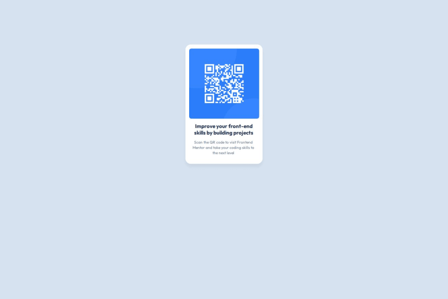
Design comparison
Solution retrospective
-
I'm most proud of achieving a design that closely matches the sample and completing the project in less time than I have in the past.
-
This challenge provided me with valuable experience in using GitHub effectively, which was new to me.
-
I’m pleased with how quickly I adapted and applied these new skills to the project.
-
Next time, I would focus on using div elements more effectively to structure my HTML code, as it would help create a more organized and maintainable layout.
-
The challenge itself was enjoyable and not too difficult.
-
However, I was initially confused when uploading the repository URL and the domain URL because I wasn’t very familiar with GitHub.
-
I watched tutorials and read articles to figure things out, and I’m glad I was able to overcome that and gain a much better understanding of GitHub.
-
This challenge has definitely increased my knowledge, and I’m excited to continue learning through more challenges on this website.
-
I would like to know how I can enhance my HTML structure. I’m aware that it may not be perfect and could benefit from some improvements. Any guidance on how to organize and structure my HTML more effectively would be appreciated.
-
I would also like advice on how to improve my CSS. I encountered issues with centralizing images and text. Despite using justify-content: center and text-align: center, I struggled to achieve the desired alignment and ended up relying on margins and padding. I’d like to understand better methods for centering content and refining my CSS to make my code more efficient and clean.
Community feedback
- P@MikDra1Posted 8 months ago
Enhancing HTML Structure:
- Use semantic HTML elements like <header>, <nav>, <section>, and <footer> for better organization.
- These elements provide meaning and context to your content.
Improving CSS for Centering Images and Text:
- To make your code responsive you should give your card a 90% width on smaller screens. Then set a max-width for the bigger sizes. Here is the code:
.card {
width: 90%;
margin: 0 auto;
max-width: 600px;
}
max-width will ensure that card never gets bigger then 600px
- Here is also my way of centering the card in the center:
.container {
display: grid;
place-items: center;
min-height: 100vh;
}
Hope you found this comment helpful 💗
Good job and keep going 😁😊😉
Marked as helpful0
Please log in to post a comment
Log in with GitHubJoin our Discord community
Join thousands of Frontend Mentor community members taking the challenges, sharing resources, helping each other, and chatting about all things front-end!
Join our Discord
