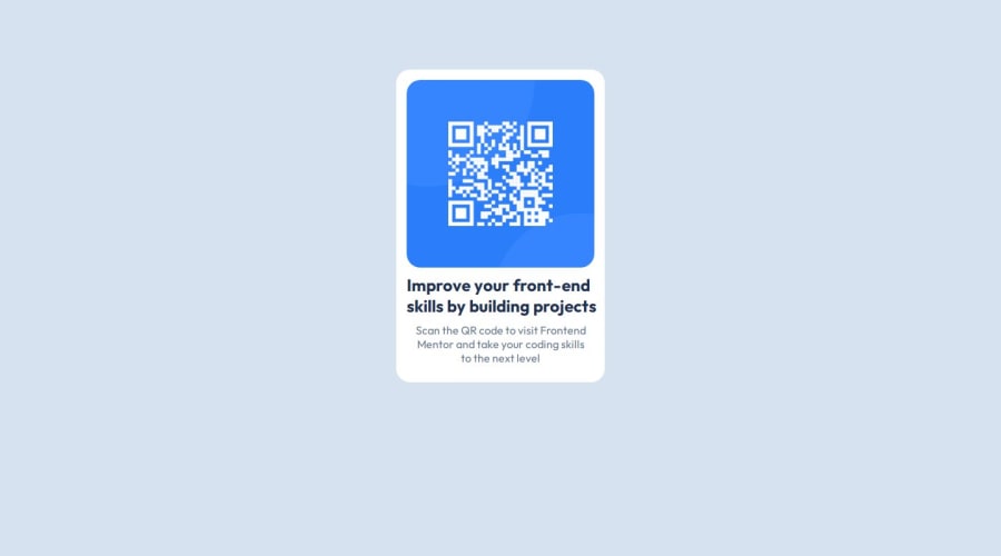


Design comparison

Solution retrospective
Being able to increase confidence in development.
What challenges did you encounter, and how did you overcome them?Trying to center elements, I looked up online and found helpful solutions
What specific areas of your project would you like help with?Having to Design the UI, I can replicate them through code by trying to come up with a design is one important thing.
Community feedback
- @alberto-rjPosted 4 months ago
👋 Hello Saad, congrats on your work!👏
I have six suggestions that could help improve your solution:
🎯 Suggestion 1: Instead of specifying a relative positioning and the
top,leftandoverflowproperties to the#qr-codeselector, as below:#qr-code { position: relative; left: 15px; top: 15px; overflow: hidden; }📝 Note: You could get the same result in just two lines with:
#qr-code {
  /* Note: 16px = 1rem => 0.9375rem = 15px */
  display: inline-block; /* Or display: block */
  margin: 0.9375rem 0 0 0.9375rem;
}
📚 Useful Resources:
- 👉 W3Schools: CSS Layout - The position Property
- 👉 W3Schools: CSS Layout - The display Property
- 👉 W3Schools: CSS Margins
🎯 Suggestion 2: Instead of specifying a relative positioning and the
leftproperty to theh2selector, as below:h2 { left: 15px; position: relative; }📝 Note: You could get the same result in just a single line with:
h2 {
  /* Note: 16px = 1rem => 0.9375rem = 15px */
  margin-left: 0.9375rem;
}
🎯 Suggestion 3: Instead of specifying a relative positioning and the
leftandbottomproperties to thepselector, as below:p { left: 25px; bottom: 10px; position: relative; }📝 Note: You could get the same result in just a single line with:
p {
  /* Note: 16px = 1rem => 0.625rem = 10px and 1.5625rem = 25px */
  margin: 0 0 0.625rem 1.5625rem ;
}
🎯 Suggestion 4: You could easily center the card on the page by adding the following rules to the
bodyselector:body { align-items: center; display: flex; justify-content: center; min-height: 100vh; }📝 Note: To work as expected, you just need to remove the following rules from the
.boxselector:.box { margin-top: 100px; margin-left: auto; margin-right: auto; }📚 Useful Resources:
🎯 Suggestion 5: Avoid using the
pxunit in CSS properties. Instead, use theremunit. This will make the layout scale correctly for people who have a different text size setting. To demonstrate go into your browser settings and change the text size to a larger value like32px— currently your solution would still be really narrow for those people. But if you useremit would adjust.📝 Note: The using of the
pxunit is generally recommended more in theborderandbox-shadowproperties. These properties do not change in relation to the text size.📚 Useful Resources:
🎯 Suggestion 6: Instead of using the
<h2>tag to specify the main heading, you could just use the<h1>tag. That way, your main heading would be in the correct hierarchical order.📝 Note: The headings are in the correct hierarchical order when:
h1is the main heading.h2is just the sub-heading ofh1.h3is just the sub-heading ofh2.h4is just the sub-heading ofh3.h5is just the sub-heading ofh4.h6is just the sub-heading ofh5.
📚 Useful Resources:
@saad-muhammad01 feel free to let me know if you need help with this challenge. I'll do my best to help you in any way I can. 😊 🤝
Marked as helpful1@saad-muhammad01Posted 4 months ago@alberto-rj Thank you so much for your suggestions!
1 - @SamOwensPosted 4 months ago
Not bad. A few things I noticed:
-
You should set a fixed width and height to make sure the card is the same size as the design. (This is only true if the component is small enough that it won't overflow the viewport on mobile)
-
The padding seems to be a little bit off between elements.
-
The QR code image should have a smaller border-radius than the card. This can be done directly on the img tag using
overflow: hidden;
Marked as helpful1 -
- @RajKumar-612Posted 4 months ago
container seems to be not in the middle of the screen
0@saad-muhammad01Posted 4 months ago@RajKumar-612 It is in the middle of the screen. If you check other solutions, both of them render the same way.
0


Please log in to post a comment
Log in with GitHubJoin our Discord community
Join thousands of Frontend Mentor community members taking the challenges, sharing resources, helping each other, and chatting about all things front-end!
Join our Discord