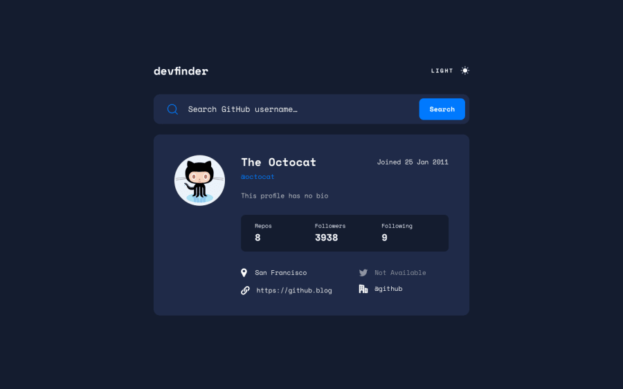
Design comparison
Solution retrospective
Definitely has some minor bugs, but overall works, took a break last week from coding, and would like to move onto a new project. Will probably come back at some point to finish fleshing it out. I also forgot to make it responsive to mobile... oops.
Community feedback
- Account deleted
Hello Kent, I do really like how you worked this project. I checked the JavaScript logic noticing the following:
Line 91 to 132 contains code that could be optimized, I like how you used the
.slice()method to get the dates, but theswitchstructure seems a little bit hardcoded. Thecreate__atstring value, can be passed as an argument to aDateobject, then the.toLocaleString()method allows you to pull out the values that you specify in different formats and return them as a string value.// created_at: '2011-01-25T18:44:36Z' let creationDate = new Date(created_at); let joinDate = creationDate.toLocaleString('en-GB', { year: 'numeric', month: 'short', day: 'numeric'}); // joinDate: '25 Jan 2011'Good job and I see you around, happpy coding!
Marked as helpful1@12KentosPosted about 2 years ago@alexcumplido
Thanks for the reply, sorry it took me so long to reply to it!
Didn't realize you could handle dates that way. I'll use it in future projects for sure.
Thanks!
0 - @MoodyJWPosted over 2 years ago
Hi Kent! Excellent job on the challenge. I noticed a few issues that might help you improve.
- definitely take a look at the HTML report, you have a number of accessibility issues regarding missing landmark elements.
- you have a styling issue in the links section at the bottom, here's a screenshot
When the text is longer as seen in the image, it's going to force the other elements to the right and it gets a bit sloppy. However, this is pretty easy to fix. There are a lot of ways to handle long strings, but my favorite is to just truncate and add an ellipsis.
On the container
div, the links wrapper, addoverflow: hiddento your sass. Then on thepelement, addoverflow: hidden; width: 100%; text-overflow: ellipsis. That's it!The icons are also a bit clipped, but that's also easy enough to fix! If you open the
svgfile for the icon, there should be a width and height. Simply set the same width and height on the containerdivand it should be perfect.Great job, keep it up!
Marked as helpful1@12KentosPosted over 2 years ago@MoodyJW Thanks,
tbh for smaller projects like this, I don't really bother that much with the semantics of the html report like needing an <h1> tag, because if this project were in a real live website it wouldn't have that. So I tend to build it based off of situations like that. If you take a look at this project bigger website You'll notice I have no accessibility issues, and neither of the html issues it gives me makes sense. (As in they shouldn't be errors).
However for the styling issue in the links section, I definitely did miss that, and appreciate your suggestions!
1
Please log in to post a comment
Log in with GitHubJoin our Discord community
Join thousands of Frontend Mentor community members taking the challenges, sharing resources, helping each other, and chatting about all things front-end!
Join our Discord
