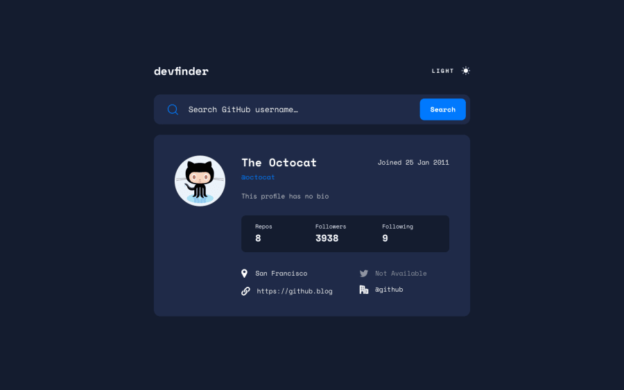
Design comparison
Solution retrospective
Hey everyone 👋:
- I was having fun playing with GitHub API.
- I added a theme toggle with a click sound.
Questions ❓ / not sure of 😶:
-
Is it okay to leave this
<h1 class="header__logo">devfinder</h1>as a heading or should I change it to a div element? -
This is the first time I split SCSS file what I could've done better?
-
How can I make the screenshot in design comparison be in dark mode?
-
How to improve the code quality in this project?
Community feedback
- @KrishnaVishwakarma1595Posted about 1 year ago
Hi, @AmrAbdelgwaad
Congratulations on completing this wonderful challenge. Your solution looks really great.
I've some improvement points for you -
-
You can autofocus the input field by default, so the user does not need to focus manually initially.
-
As the input is required it shows the browser default require message. You can also provide your custom one.
-
After the successful search, you can clear the input so the user does not need to clear it manually again and again.
-
When no result is found, even when we clear the input the text "No results" still showing. Instead, you can hide it as well on clear input.
-
On click of the theme switch the theme switches so fast which feels a bit odd in the eyes. You can give a bit of a transition effect like below so that it'll be smooth and nice looking.
transition: all .3s linearI hope these points will help you. Great solution.
Happy Coding
Marked as helpful0 -
Please log in to post a comment
Log in with GitHubJoin our Discord community
Join thousands of Frontend Mentor community members taking the challenges, sharing resources, helping each other, and chatting about all things front-end!
Join our Discord
