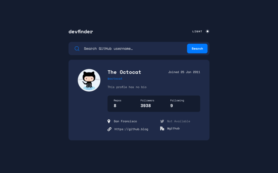
Design comparison
SolutionDesign
Solution retrospective
The bottom part with the city was really hard for me. I'm unsure about it.
Community feedback
- @Taku-chimanazPosted 12 months ago
Hie Serah
I have viewed your solution and great job so far.
I just wanted to point out that you can remove the outline border on your search input with
input {
  outline-width: 0
}
I think the search input would look much better with that.
Marked as helpful0
Please log in to post a comment
Log in with GitHubJoin our Discord community
Join thousands of Frontend Mentor community members taking the challenges, sharing resources, helping each other, and chatting about all things front-end!
Join our Discord
