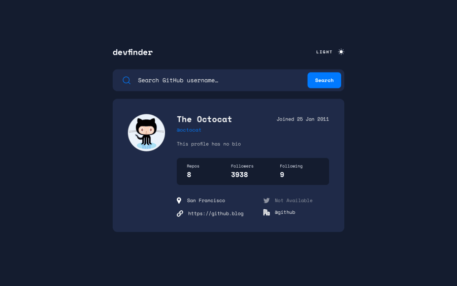
Design comparison
SolutionDesign
Solution retrospective
I really enjoyed this challenge and also learning Tailwind CSS.
I can see the benefits of Tailwind (implementing the dark theme was much easier and I like that it's fully customisable) and also some of the limitations.
I am trying to keep accessibility in mind on every site but I have removed the focus state on the input simply to keep with the design provided. I also had to remove the autocomplete because I was struggling to change the default chrome styling using Tailwind.
Any feedback would be welcome! Thank you.
Community feedback
Please log in to post a comment
Log in with GitHubJoin our Discord community
Join thousands of Frontend Mentor community members taking the challenges, sharing resources, helping each other, and chatting about all things front-end!
Join our Discord
