@JoannaLapa
Posted
Hi LSH,
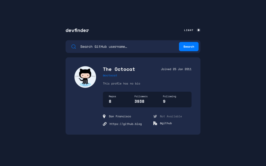
My congratulations on finishing the project! I can find users and I see all the needed information correctly. I can switch between dark and light mode, it works. Good job!
Some details that you can improve:
Concerning main functionality:
-
Website, Twitter, and company information should all be linked to those resources. On the website there is a mistake - it tries to join https://gitgithub-user-search-app.netlify.app/ and the user's website address, then when I try to open the resource the page is not found. Twitter and company information aren't linked to their resources (and there isn't a cursor pointer).
-
When I click on the button and the input value is empty there should be an error 'No results'
-
When I try to find a user by his full name with spaces (like Joanna Łapa) I see an error - you can resolve this case if you split the input value using the following methods: .value.split(' ').join(''). If this is not clear you can see it here with my solution
Some very small design details if you would like to improve:
-
Your h1 has a typo (it should be devfinder instead of debfinder).
-
Your search icon is smaller than the original version.
-
I feel the impression that the font-family Mono Space doesn't work on the username (h1).
-
A hover on the button doesn't work.
I hope that my feedback was helpful! Happy coding! Joanna

