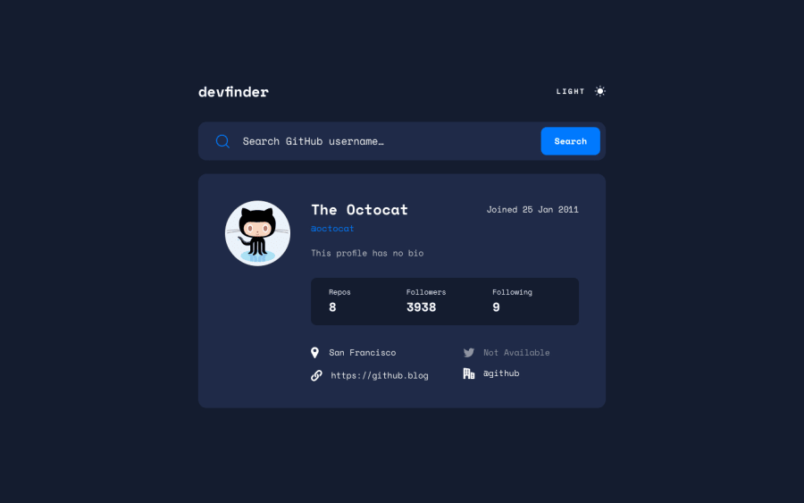
GitHub User Search app with Sass, JS, CSS Grid, Flexbox and Parcel
Design comparison
Solution retrospective
Some feedback on theme toggling would be greatly appreciated. Thanks!
Community feedback
- @BurritoDoggiePosted about 3 years ago
Hi!
I love it! It is so cool! I think it is actually very practical and I might use it! It was accurate,and I could find users that actually existed! You did fantastic on the dark mode! I love dark mode. It was really fun to look at people's profiles. Please do more challenges!
Keep Coding!
(●♡∀♡)
Marked as helpful2@dmitrymitenkoffPosted about 3 years ago@BurritoDoggie thanks for your feedback! I must say I struggled with the dark mode implementation the most, especially with the CSS part of it. I've added some useful resources to the Readme file - feel free to check those out if you need more info on the topic:)
1 - @ChamuMutezvaPosted about 3 years ago
Well done DMITRY
- some of your images are missing the alt attribute - it is very important to include it. Decorative images can have
alt="" - on the theme switcher, in it's present state (a div) it is not focusable with a keyboard. Using semantic html should be the first choice.
Happy coding
Marked as helpful1@dmitrymitenkoffPosted about 3 years ago@ChamuMutezva Hey Chamu, Thanks for your constructive feedback! I ended up adding an empty alt and tab index for the toggle div. Cheers!
1 - some of your images are missing the alt attribute - it is very important to include it. Decorative images can have
Please log in to post a comment
Log in with GitHubJoin our Discord community
Join thousands of Frontend Mentor community members taking the challenges, sharing resources, helping each other, and chatting about all things front-end!
Join our Discord
