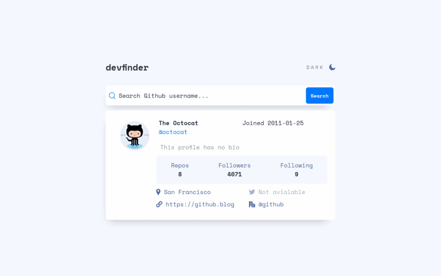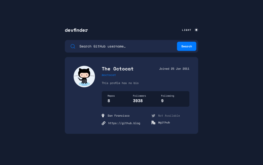
Design comparison
Solution retrospective
In mobile view the keyboard pushes the input up, removing the 100vh in the body in css fixed the problem but the page wasn't centered, kindly look through my code and help me fix this. Thank you
Community feedback
- @fidellimPosted about 3 years ago
Hi @eboriley,
You just need to add this code:
body {
    min-height: 100vh;
}
This will let your page expand if the page is more than 100vh.
Marked as helpful0@eborileyPosted about 3 years ago@fidellim One more thing, I probably must be doing something awful because for 18 submissions made I should be scoring more than 250 points. What do you think I am doing wrong and how can I improve.
1@fidellimPosted about 3 years ago@eboriley Hey Emmanuel, there is a maximum limit of 150 points per day. So if you want to utilize your points, try to submit projects the next day if you already reached 150 points.
0@eborileyPosted about 3 years ago@fidellim Thanks Fidel, but what are the maximum points can you score per submission. I score 10 for a newbie, 20 for junior challenges. Is it possible to score more than just the points for submitting a challenge
1@fidellimPosted about 3 years ago@eboriley Yes you can score points by commenting on other people's work as well. If the other user marks your comment as helpful you will gain some points :)
Marked as helpful1
Please log in to post a comment
Log in with GitHubJoin our Discord community
Join thousands of Frontend Mentor community members taking the challenges, sharing resources, helping each other, and chatting about all things front-end!
Join our Discord
