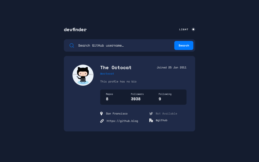
GitHub user search app solution
Design comparison
Solution retrospective
This project helped me conquer jquery
Community feedback
- P@BboyAkersPosted over 1 year ago
Great Job! Would love to see if you can make the text for 'light' and 'dark' clickable too! That'd be nice! A small UX change! Also for the light theme, try to add the proper background for the input/form. The white background. For me at least, it looks inherited from your body background
0@Felix221123Posted over 1 year agoHeyy thanks for the comment, your comment really helped and i have fixed all the issues you requested.thanks once again @BboyAkers
1
Please log in to post a comment
Log in with GitHubJoin our Discord community
Join thousands of Frontend Mentor community members taking the challenges, sharing resources, helping each other, and chatting about all things front-end!
Join our Discord
