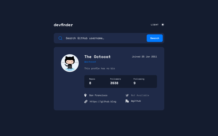
Design comparison
Solution retrospective
Hello everyone! Hope you are having a ton of fun with the challenges.
This challenge was really interesting I encounter 3 problems and 2 I didn't expect to find them.
-I was not able to make the search input be responsive :(
-When you select a name with the arrows of the keyboard the background of the input gets a color and haven't been able to clear that.
-And I was able to use the prefers-color-scheme, but I have to reload the page in order for it to understand, would be really cool if it could read it automatically.
If you guys know how to fix any of this I would really appreciate it :)
Thanks!
Community feedback
- @vanzasetiaPosted about 2 years ago
Hi, Lorenzo Franco! 👋
For the search input, I would recommend making it the main container of the search icon and the search button. So, instead of using
form, I suggest making theinputthe main container. You can try using absolute positioning to position the search button inside theinput. For the search icon, I would recommend making it the background image of theinput. (Inspiration: my solution)Regarding your second question, I assume that it's about when the users select the value of the input, there's blue background color appears. If that's the case, then it's fine to have it. You can control the background color with using
::selectionCSS pseudo-element. As a side note, never remove the::selectionbackground color. It exists so that the users know the current text that they are selecting.For your last question, you can use JavaScript to make the website listens to the user's color scheme preference. (Reference: https://web.dev/building-a-theme-switch-component/#synchronizing-with-the-system)
window
    .matchMedia("(prefers-color-scheme: dark)")
    .addEventListener("change", ({ matches }) => {
      // do something with the "matches"
    });
That's it! I hope you find this useful! 🙂
0 - @shashreesamuelPosted over 2 years ago
Hey good job completing this challenge.
Keep up the good work
Your solution looks great however I think the placeholder in the search bar can be a bit bigger.
In terms of your accessibility issues simply wrap all your content between
maintagsI hope this helps
Cheers Happy coding
0
Please log in to post a comment
Log in with GitHubJoin our Discord community
Join thousands of Frontend Mentor community members taking the challenges, sharing resources, helping each other, and chatting about all things front-end!
Join our Discord
