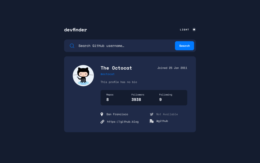
Github User Search App - ReactJS, SCSS, Axios
Design comparison
Solution retrospective
This was an incredibly fun and challenging project to tackle and it gave me opportunities to showcase my knowledge of both SCSS and React. Working with SCSS definitely made this project that much more bearable when it came to organizing all of my styling and responsiveness much easier.
Questions, critiques, and comments welcome!
Community feedback
- @Sloth247Posted almost 3 years ago
Hi JibbyCodes, this is the best solution that I've ever seen on FEM for this challenge. I may need to revise my coding based on your solution 😁 I'm sorry if I am wrong but the useEffect for the theme in your context file should be "useLayoutEffect". I did a bit of research after finishing my solution and according to official React documentation, "useLayoutEffect will be flushed synchronously, before the browser has a chance to paint.", so this hook might be good to use there.
I appreciate if you give me feedback on my solution too 😊
Your solution is really nice.
Marked as helpful0@KijimaiPosted almost 3 years ago@Sloth247 Hi Sloth! Thank you for your comment, and after looking over about the differences between the two (useEffect and useLayoutEffect) I might just refactor my solution to accommodate that as well! I've never used useLayoutEffect before but I will definitely start considering applying that in future projects from now on.
I'll take a look at your solution as well and maybe I can learn a thing or two from yours!
1
Please log in to post a comment
Log in with GitHubJoin our Discord community
Join thousands of Frontend Mentor community members taking the challenges, sharing resources, helping each other, and chatting about all things front-end!
Join our Discord
