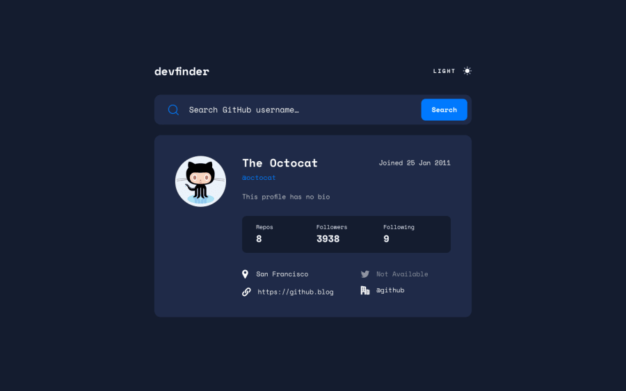
Design comparison
SolutionDesign
Solution retrospective
Hey everyone !
Please try to search for your Github profile, and let me know if anything goes wrong ^^'
Any feedback is appreciated,
Happy coding :)
Community feedback
- @vanzasetiaPosted over 2 years ago
Hi, Ambre! 👋
Congratulations on completing this challenge! 🎉
I searched my own profile and I didn't see any issue. Good job! 👍
Here are some recommendations for improvements.
- I would recommend using the
Date()object to format the date. This way, you can get the date easily by using some methods. For example, to get the month index number, just usegetMonth()method. - I would recommend using
hiddenattribute instead.hiddenstyling if possible. It is a little bit easier to use thehiddenthan to create a hidden styling. - For the statistic, I would recommend using a list element. Also, the
user-info__stats__titleshould be aspaninstead ofh3. I highly recommend reading the "How-to: Accessible heading structure - The A11Y Project" article to learn more about headings. If the site has no styling then it will look something like this.- Repos 8
- Followers 3938
- Following 9
That's it! I hope this helps! 🙂
0 - I would recommend using the
Please log in to post a comment
Log in with GitHubJoin our Discord community
Join thousands of Frontend Mentor community members taking the challenges, sharing resources, helping each other, and chatting about all things front-end!
Join our Discord
