Design comparison
Solution retrospective
Feel free to give me any feedback.
Community feedback
- @ccreusatPosted about 3 years ago
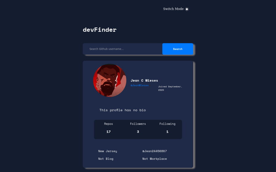
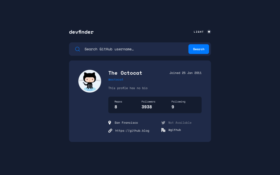
Your challenge is far from the original design. That is what I mean. You could use a software design like FIGMA to put the design and a screenshot of your render above another to compare and get as close as possible to the original design. Your challenge works perfectly, it's really nice but the design can be improved :-)
Marked as helpful0@JeanMiesesPosted about 3 years ago@ccreusat I see. I will take that into consideration for the next one. Thanks for the feedback!
0 - @ccreusatPosted about 3 years ago
It's working really well but CSS seems broken ?! :-)
0@JeanMiesesPosted about 3 years ago@ccreusat Sorry, but what do you mean? Can you be more specific? What part of the CSS is broken?
0
Please log in to post a comment
Log in with GitHubJoin our Discord community
Join thousands of Frontend Mentor community members taking the challenges, sharing resources, helping each other, and chatting about all things front-end!
Join our Discord
