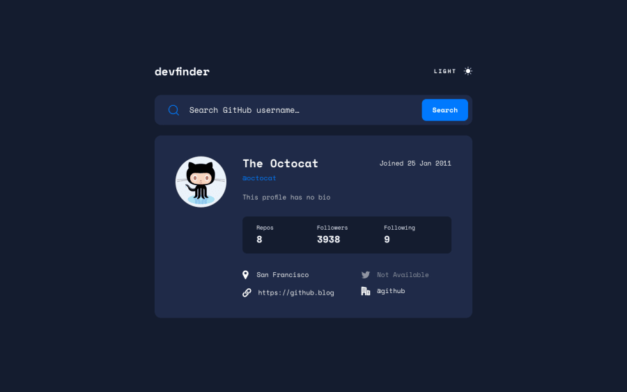
Design comparison
Community feedback
- @MoodyJWPosted over 2 years ago
Hi Thiago! Great job on the challenge! I noticed a styling issue in the section with location, twitter, etc. If the content is longer it will overflow the container and cover the second column.
Here's a screenshot of what I'm talking about
You can probably fix this with some relatively simple CSS on the element containing the text
text-overflow: ellipsis;
overflow: hidden;
width: 100%;
As long as the parent element has a width, the text should cut off at the edge of the parent element. You might need to adjust that width based on how you've set up the flex boxes.
I'd also suggest trying to start developing for mobile first, it makes styles a lot easier to adjust when you're getting bigger instead of smaller. Plus over 90% of people in the world access the internet via mobile, so most frontend work is going to require responsive styles. Still, this looks really good and the small change to the text should make the desktop version perfect! Hope this helps, let me know if you need more info.
Marked as helpful0@tssantosPosted over 2 years ago@MoodyJW Thanks for your comments! I'm going to take a look at suggested points.
1
Please log in to post a comment
Log in with GitHubJoin our Discord community
Join thousands of Frontend Mentor community members taking the challenges, sharing resources, helping each other, and chatting about all things front-end!
Join our Discord
