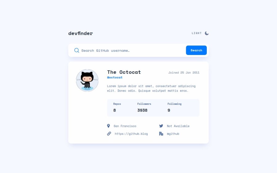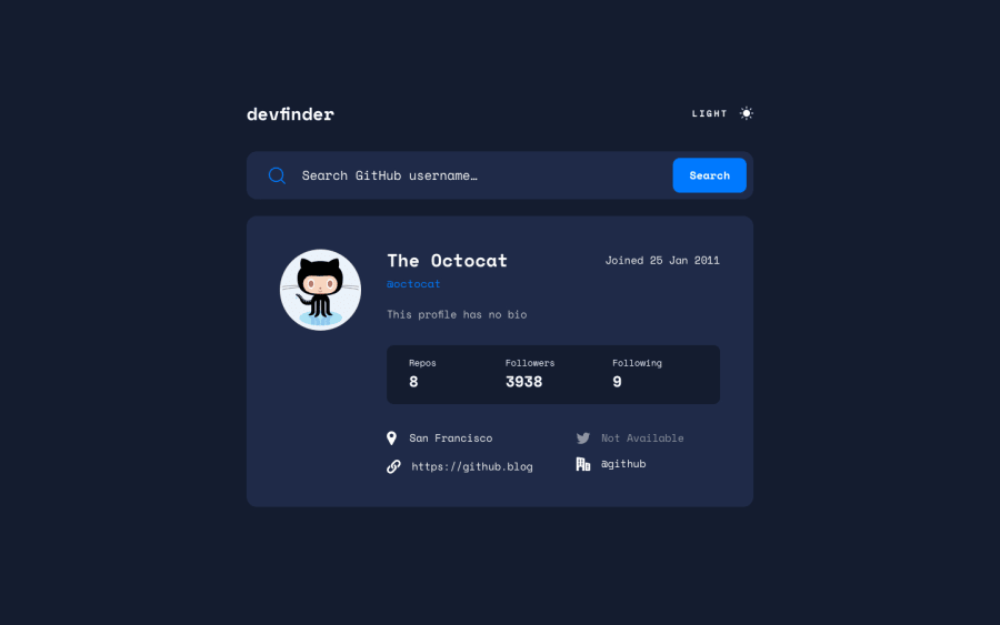
Design comparison
Solution retrospective
Hi everyone;) With this challenge I continued my training regarding the use of APIs and the management of incoming data. Overall I didn't have any major problems, it was a good workout.
If you want to tell me your opinion about the solution, and if you think there is something to improve or you want to give me some advice or feedback, I'm here ;)
Community feedback
- @matt-o-westPosted 10 months ago
Hello! Thank you for your submission! I have some feedback for you:
- In your input, you've added an onclick event listener. While this is fine, it can improve the user experience (and is best practice) if you code this as form with an onsubmit. When the form is submitted, you perform the same callback function.
- Your theme is toggling correctly, but the UI isn't updating the string label for the theme button (i.e. it always says 'Light' regardless of the current state). It should be a simple fix, adding into your toggle function to update the text inside that node when the theme toggles.
- Responsiveness is looking good, although your placeholder text is crashing with error messages in mobile when they appear. You might need to put the error message above or below the input on mobile.
Above all, the solution you submitted is great and you should be proud! Great work! 🎉
Marked as helpful1@p4bloxxPosted 10 months agohi @matt-o-west and thank you very much for your feedback ;) regarding the light/dark toggle label I didn't really notice the error even though I looked at it several times... regarding the other two errors I thank you, I should have looked again and try everything again in more detail...my mistake. I'm happy that overall you liked it as a solution, see you next time and thanks again ;)
0
Please log in to post a comment
Log in with GitHubJoin our Discord community
Join thousands of Frontend Mentor community members taking the challenges, sharing resources, helping each other, and chatting about all things front-end!
Join our Discord
