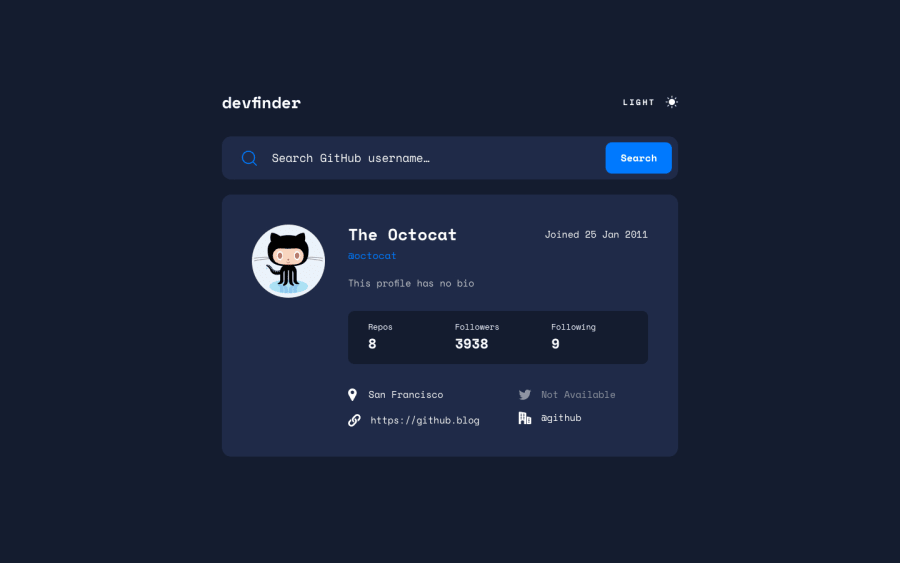
Design comparison
SolutionDesign
Community feedback
- @DanoBrozPosted over 2 years ago
It's nice you've selected the mobile first approach, but It seems you forgot about desktop view. In the design provided you can find that the content of the app is 730px wide on the desktop (so just like in your breakpoints it would be 768px up). I'd suggest to add other breakpoint rules ex. between 481px — 768px - tablet and implement desktop view for higher breakpoint.
0
Please log in to post a comment
Log in with GitHubJoin our Discord community
Join thousands of Frontend Mentor community members taking the challenges, sharing resources, helping each other, and chatting about all things front-end!
Join our Discord
