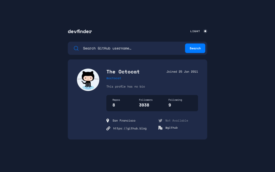
Design comparison
Solution retrospective
Hi, how do you make the dark/light button to work if the user is under dark mode for their desktop? When this was under dark mode (from my desktop prefer background). I can not switch the page from light to dark and vice versa. The only thing I could think of is to add " !important " to every line of code in my JS file. I was hoping to learn a better approach for this problem. If you have any suggestion about my code structure, or an easy to understand method to tackle this challenge, please leave your comments. Thank you.
Community feedback
- @grace-snowPosted about 3 years ago
Following on from Slack…
The quick tips I can give are
- revisit how and when to write alt text
- read about when to use buttons and anchors
- Rethink html semantics for the card content, particularly the stats, form and socials. A description list with key value pairs or an unordered list would be more appropriate for stats. social icons should be links to take you to those sites otherwise the content is meaningless. Input labels and error messages are not the same things
- look up how to build accessible toggles. Hint where there are two or more labelled states, a fieldset with radio inputs will almost always be the best way to go
- Look up how to use css custom properties for theming. No inline styles should be being set in JavaScript at all and you shouldn't need to grab all the elements individually. All a theme switch needs is to swap a data attribute or class on the body that then changes the custom properties (css variables). The JavaScript can also do a check for the prefers color scheme to set the default on load.
I hope this helps
Marked as helpful2
Please log in to post a comment
Log in with GitHubJoin our Discord community
Join thousands of Frontend Mentor community members taking the challenges, sharing resources, helping each other, and chatting about all things front-end!
Join our Discord
