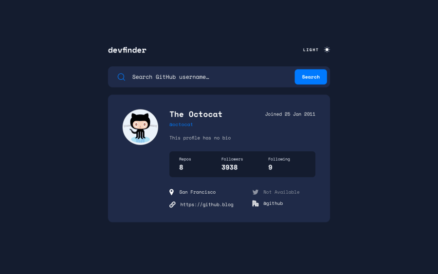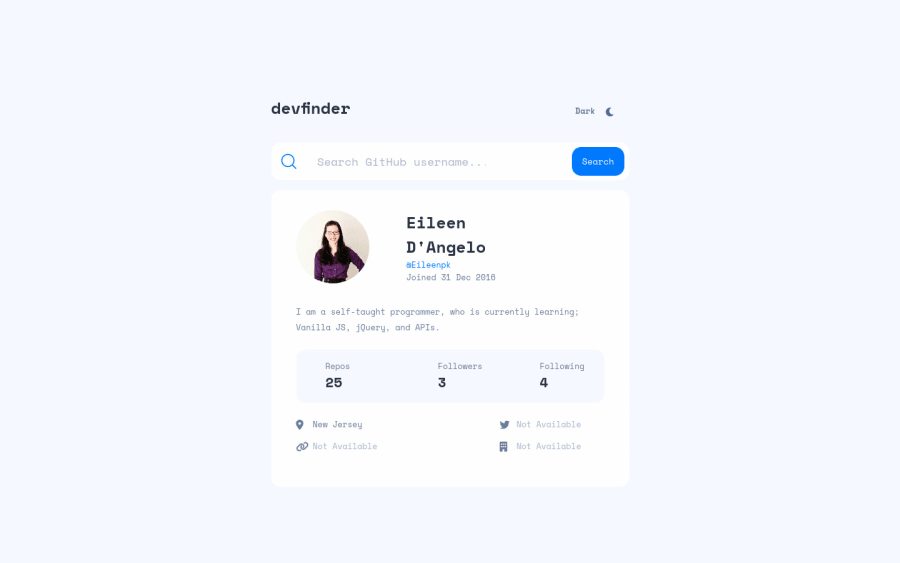
GitHub user search app- Flexbox, Vanilla JS, and API.
Design comparison
Solution retrospective
This was a good project! I had a hard time figuring out how to change the input value if null so I could add the class onto the element displaying the text Not Available. Getting this one part right took 75% of the time I spent on the challenge : ). In the end, I finally figured out that you can use the || operator in template literals. The only link that I couldn't get to work was for the user's company, I'm not sure why. If anyone can figure it out let me know!! I also made it so that it brings up my GitHub profile on load so if you want to compare the design to the one I made go to the live site and search octocat.
Community feedback
- @vanzasetiaPosted over 2 years ago
Hi, Eileen dangelo! π
Congratulations on completing this challenge! π
I highly recommend getting the HTML right first.
- Use interactive elements for anything that has interactivity. In this case, the theme switcher is using
div
at the moment. I recommend either using the checkbox orbutton
. Also, I found that A Theme Switcher and Toggle Buttons articles help me to create an accessible theme switcher. <lable>
is not valid HTML tag. I am sure that it should be<label>
. But, you need to fix this. Otherwise, it is not valid HTML.- Wrap all the
input
,label
, andbutton
withform
element. After that, on JavaScript, grab theform
element and then make it listen to thesubmit
event. - The
info-container
should be a list. Also, theh4
inside theinfo-container
should be replaced byspan
orp
. The heading tag has a meaning which is like a title in a document. In this case, it can't be a title for a number below it. - The
link-container
also should be a list with four bullet points. - Location is not a link. It is just plain text.
- There are more actually like
bio
should not be asection
andh3
, "Not available" links should not be link elements (it's just a plain text), etc. So, I suggest learning about web accessibility.
I would recommend getting the HTML right first. It is important to get the page structure correct because it really impacts the accessibility of the website. Also, an accessible website can lead to more user engagement since almost everyone can access your website.
That's it! I hope this helps! π
0 - Use interactive elements for anything that has interactivity. In this case, the theme switcher is using
- @MoodyJWPosted over 2 years ago
Hi Eileen, great job on the challenge! Your question about the company, I think I see what's wrong.
You're using the
company
property on the user data, but the one you want is actuallyorganizations_url
. A bit confusing, but if you look at the data in your network tab you'll seecompany: null
and that property is actually just astring
for the user's company,company: "Company Name"
.A styling issue I noticed is that you haven't accounted for longer strings overflowing their container. Here's a screenshot of what I'm talking about. You can probably solve this pretty easily by adding a couple of styles to your
<a>
:text-overflow: ellipsis; overflow: hidden;
That would likely solve it for all screen sizes.
I also encourage you to take a look at your HTML report as you have quite a few issues there. For example, you typo'd on a
<label>
element.Hope this helps you out. Don't forget to be proud of all the things you did right!
0
Please log in to post a comment
Log in with GitHubJoin our Discord community
Join thousands of Frontend Mentor community members taking the challenges, sharing resources, helping each other, and chatting about all things front-end!
Join our Discord