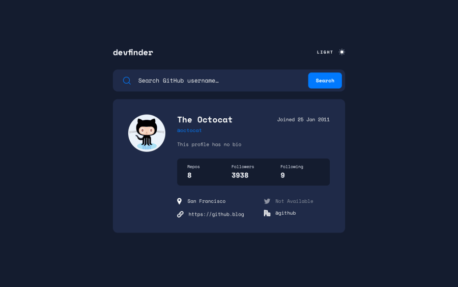
Not Found
Not Found
Not Found
Not Found
Not Found
Not Found
Not Found
Not Found
Not Found
Not Found
Not Found
Not Found
Not Found
Not Found
Not Found
Not Found
Not Found
Not Found
Not Found
Not Found

Submitted

Github user search app | CSS grid, SVG, Cypress

P
Omar M 110

@omonteon

Desktop design screenshot for the GitHub user search app coding challenge

This is a solution for...

  • HTML
  • CSS
  • JS
  • API
2junior
View challenge

Design comparison


SolutionDesign

Solution retrospective


Hello !

Thanks for taking some time to review my solution to this challenge. This is my second submission overall.

With this challenge I learned more about:

  • Creating a layout with CSS grid.
  • CSS custom properties.
  • SVGR.
  • End to end testing with Cypress.

All feedback is appreciated. However, if I had to ask for something in specific, I would ask your opinion about:

  1. My CSS grid implementation.
  2. Accessibility. I'm a beginner in regards to this topic, so any feedback on this would be great !

Community feedback

@pikapikamart

Posted

Hey, awesome work on this one. Layout is great in desktop and I suggest first to default search the octocat like in the design so that it won't feel empty at first, it is responsive just a little issue on around 580px going to 525px horizontal scrollbar appears. Mobile layout looks really great.

Some other suggestions would be:

  • Don't style the html leave those on the body tag.
  • The theme toggle works but it would be better to use input type="radio" on those because using button is not accessible enough in this kind of component.
  • The reason that you should use radio button is that, color theme is a selection right and radio buttons are intended for those, either select light or dark. You will need 2 radio buttons each having their own label, they will nested inside a fieldset along with a legend attribute, the legend could be a screen-reader only. I don't have this challenge, but you can take a look at my todo-app-solution inspect the layout and see the structuring of my color-theme. This is much accessible.
  • Theme svg should be hidden so use aria-hidden="true" on svg that are purely decorative.
  • Your input's label should have a descriptive text-content that defines what is the purpose of the input. The label would be a screen-reader only text, use sr-only class, the text-content could be Enter githhub username, that magnifying glass should just be a background-image of the input.
  • The form works but since these is no indication on whether it has searched someone or not for "not" sighted users. I suggest to add an aria-live element which will announce if there is a user found or if there is not. This way, it will be more accessible since the error-message is not being used properly as the aria-describedBy of the input element.
  • Again for the input if there is no user found, maybe add an aria-invalid="true" on the input this way users will be informed that their input is wrong. Also, add an id attribute on the error-message, this id will be referenced by what I said, aria-describedBy on the input as well, this way they will know what kind of error has it produced. You will be using .setAttribute and .removeAttribute if you are going to use ref in react or just create a state to check for the input attribute.
  • The alt for the user's image should be their username. Avoid using words that relates to "graphic" such as "avatar" in the alt attr.
  • Don't just use span to wrap text-content, use p tag on them.
  • You could use table element for the 3 section after the person's name or use ul element since it is a "list" of information.
  • On the 4 items on the bottom part, use ul on those since they are "list" as well.
  • Each icon should be hidden by aria-hidden="true".

Aside from those , site looks really great. Great work again on this one.

Marked as helpful

1

P
Omar M 110

@omonteon

Posted

@pikamart Thank you for such a great feedback ! It's really cool that you took the time to comment on all the improvements related to accessibility. I'm sure I'll learn a lot implementing all your suggestions.

** EDIT **

  • Added octocat as default.
  • Fixed responsive issue between 525px and 580px.
  • Changed global styles to be scoped to the body.
  • Started working on using a fieldset and radio buttons for the theme switch.
  • Added aria-hidden to decorative svgs.
0

Please log in to post a comment

Log in with GitHub
Discord logo

Join our Discord community

Join thousands of Frontend Mentor community members taking the challenges, sharing resources, helping each other, and chatting about all things front-end!

Join our Discord