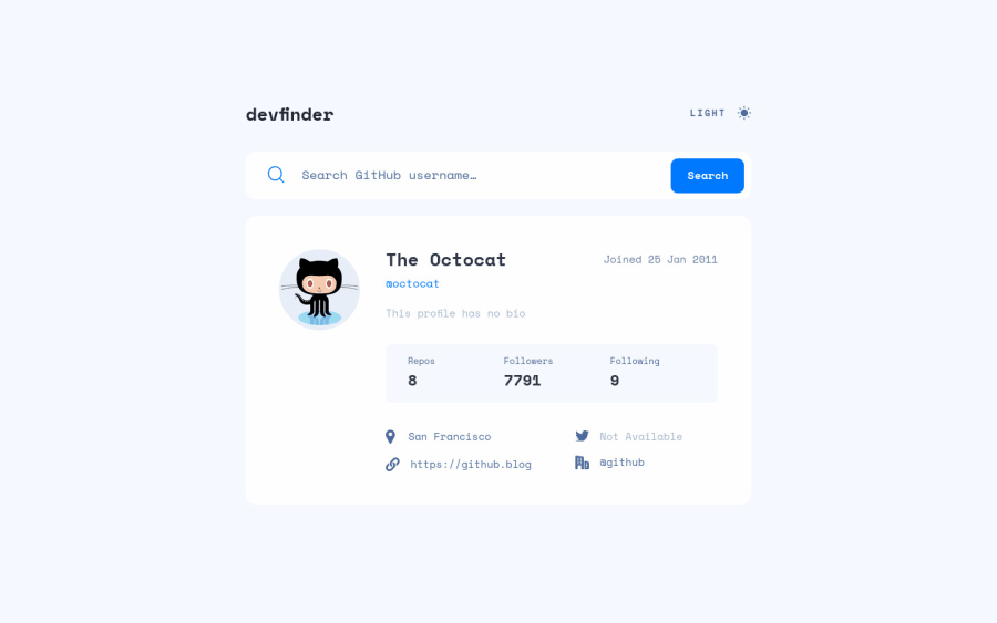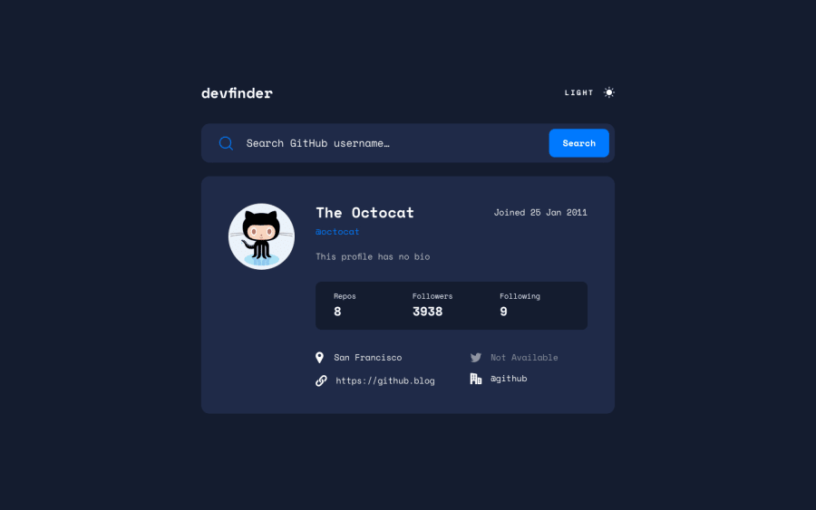
Github API search app made with Parcel, future CSS syntax, BEM
Design comparison
Solution retrospective
Hi there, this is my solution for the Github Search App challenge. I used parcel for the first time, which allowed me to use modern CSS syntax, like @custom-media, as well as nested media queries. I really enjoyed that!
Please let me know if you spot any mistakes or bad practices!
Community feedback
- @JaneMorozPosted almost 2 years ago
Hey! I like your solution! ❤️
The only thing I've noticed:
- You need to wrap the main content of the page into the <main> tag. It will solve all these landmark issues and improve accessibility.
- Also you might want to use the <header> tag for the header (instead of
div).
Keep it up! And good luck 🍀
Marked as helpful0@10highPosted almost 2 years ago@JaneMoroz Yes! I'm actually embarrassed that I completely forgot to do that and only realised when I saw the accessibility report.
I need to add running my source files through a validator before "delivering" to my work routine.
Thanks for pointing it out!
1
Please log in to post a comment
Log in with GitHubJoin our Discord community
Join thousands of Frontend Mentor community members taking the challenges, sharing resources, helping each other, and chatting about all things front-end!
Join our Discord
