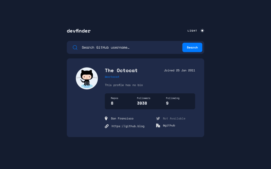
Design comparison
SolutionDesign
Solution retrospective
I would greatly appreciate any feedback that you may have!
I learned a lot about themes from this challenge. It took me a long time to get everything working, but now it functions as intended.
- I wrote a simple function that shortens links visually (
https://www.frontendmentor.io/->frontendmentor.io). I noticed that if the link was too long, it would push the whole content, so I decided to shorten them, and I also set amax-widthon each link. I'm not entirely certain about themax-widthproperty, but it seems to work - I used the
fechalibrary to format the date - I added a loading spinner
- I made a custom favicon :)
How does my theme switcher and JS logic look overall?
Community feedback
Please log in to post a comment
Log in with GitHubJoin our Discord community
Join thousands of Frontend Mentor community members taking the challenges, sharing resources, helping each other, and chatting about all things front-end!
Join our Discord
