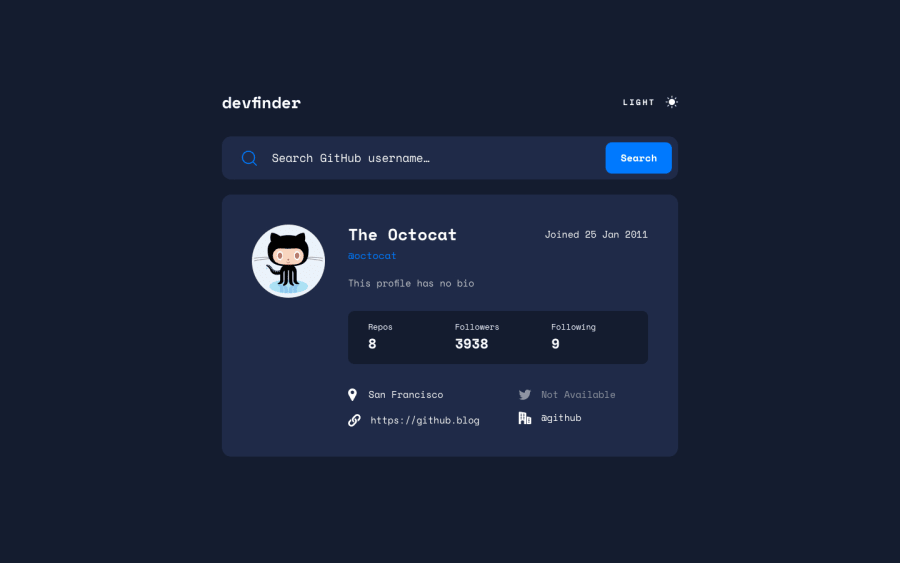
Design comparison
Solution retrospective
Hey there,
This is my solution to the GitHub user search app.
The markup is plain HTML and styling is done through Tailwind CSS. For the search logic and dark mode toggle, I wrote some plain JavaScript functions.
Dark mode is implemented by toggling a class on the document element. The preference is stored in localStorage, so that the next time one visits the app it remembers the decision. If not set, a media query gets the system's color scheme, so that dark mode is used if it's enabled on the OS level.
The app is fully responsive and has some basic error handling. Let me know what you think :)
Community feedback
Please log in to post a comment
Log in with GitHubJoin our Discord community
Join thousands of Frontend Mentor community members taking the challenges, sharing resources, helping each other, and chatting about all things front-end!
Join our Discord
