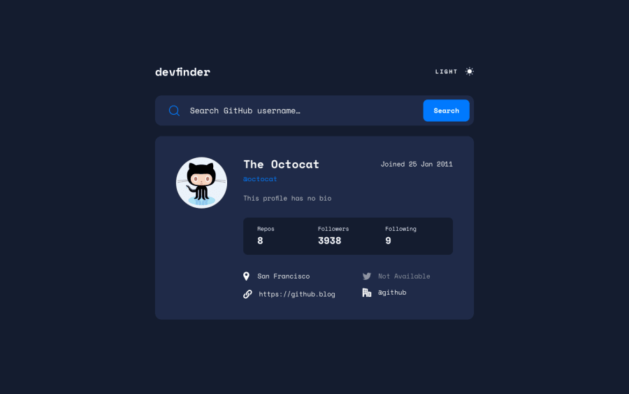
Design comparison
Solution retrospective
i messed around with the url for this project. so whenever the user enters something in the search bar and submits, the search gets added to the url. so, whenever the user refreshes the same page will come up. did the same thing with the theme changer.
what do you guys think? any tips/critiques are much appreciated.
Community feedback
- @correlucasPosted over 2 years ago
👾Hello Jax Teller, congratulations for your new solution!
Your solution is just amazing, I liked a lots the work you did with the loading, was funny the
loooooooaaaading.I've to say thats really beautiful to see finally a
PIXEL PERFECT SOLUTION. Congrats this is really hard to reach!I don't have the knowledge in JS to judge your challenge but I see everything workin fine, I did also the Github user search and works amazing.
👋 Keep it up and happy coding!
Marked as helpful0 - @DavidMorgadePosted over 2 years ago
Hello Jax, congrats on finishing the challenge!, when I did this one it was a lot of fun and it's one of my favourites so far!
Just a little thing that I think you can improve, in the loading time, instead of that big chunk of text (the first time I saw it I really got scared haha), why don't you use some fancy spinner loader or something like that?, you don't even have to create it yourself, there are a lot out there that you can just get the CSS and render it in your project while loading.
Would also be nice if you add to your App the bonus of this challenge, wich is getting the default theme of the user browser and set it at start!
Apart from that I have tried the App with a few searchs and it seems to work perfectly, good job on that!
Hope my feedback helped you!
Marked as helpful0
Please log in to post a comment
Log in with GitHubJoin our Discord community
Join thousands of Frontend Mentor community members taking the challenges, sharing resources, helping each other, and chatting about all things front-end!
Join our Discord
