Design comparison
SolutionDesign
Solution retrospective
What challenges did you encounter, and how did you overcome them?
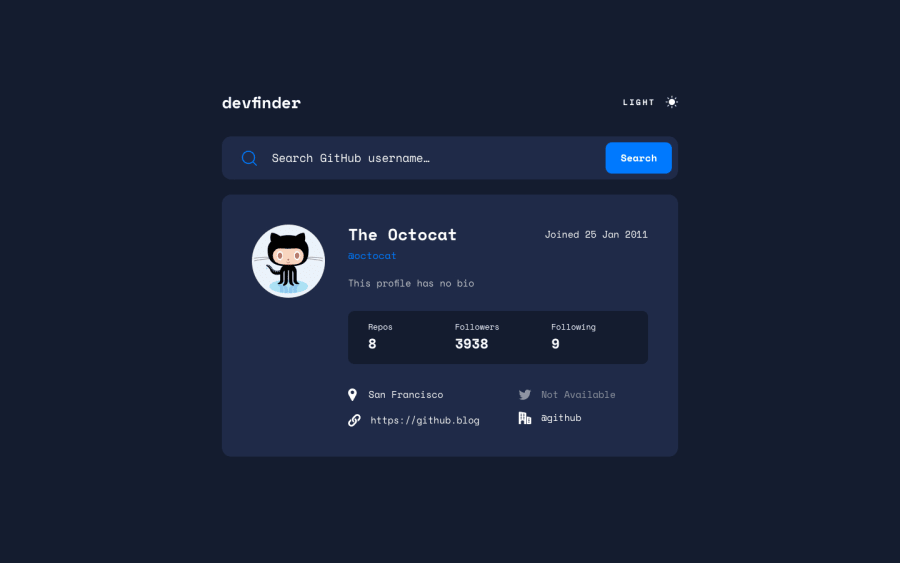
The search bar and the 'not available' fields were pretty tough.
----Search Bar---- The search bar's no results error message was tricky to fit for small devices so I decided to replace the placeholder text of the input field with the 'No results' string and add an error class to it. The final result looks smooth and visually appealing.
---Null Fields--- I managed to check the empty user values and return the 'Not Available' string and also add the lower opacity class to them dynamically.
Community feedback
Please log in to post a comment
Log in with GitHubJoin our Discord community
Join thousands of Frontend Mentor community members taking the challenges, sharing resources, helping each other, and chatting about all things front-end!
Join our Discord
