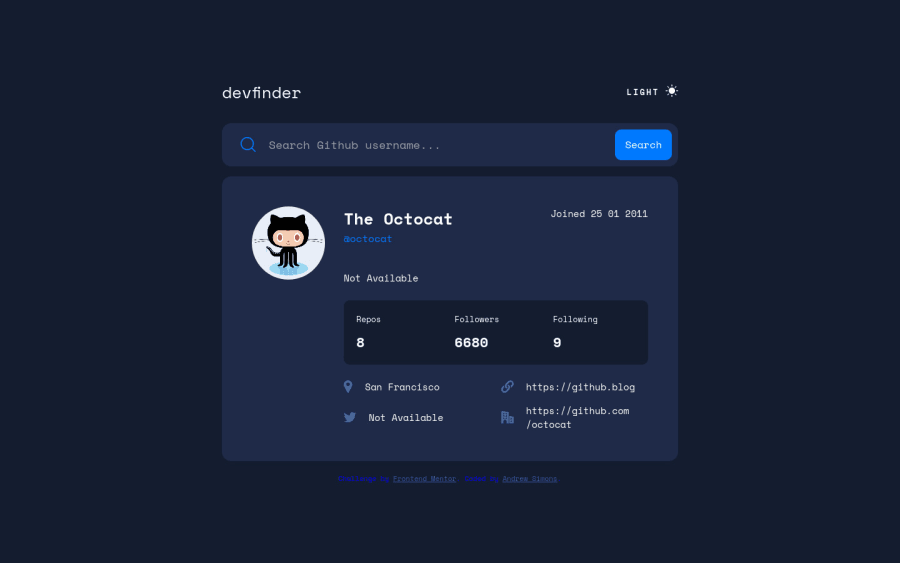


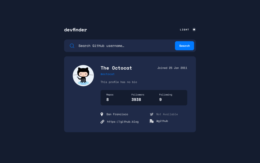
Design comparison
Solution retrospective
I found the most difficult part to be the light/dark mode. Perhaps I went the wrong way about it but I ended up selecting all of the html tags specifically to assign colors and backgrounds and toggling a "light-mode" class on and off.
Also updating each innerHTML element with the data became quite meticulous as well. Not sure if there is a better way to go about this in pure JS. The error handling may also need work. All in all it was a really fun challenge and am proud of the result. Any feedback is greatly appreciated!
Community feedback
- @elaineleungPosted about 2 years ago
Hi Andrew, about the light/dark mode, you can check out Adam Argyle's post here, which helped me a lot when I was building my calculator with 3 themes: https://web.dev/building-a-theme-switch-component/. This is useful if you want to use
prefers-color-schemebefore the page loads. His tutorial also shows how the icon can be changed, so that might help you out as well! Also, if you're interested, here is the calculator app I built using his tutorial.Marked as helpful0 - @md5daltonPosted about 2 years ago
Hello Andrew. Congratulations on finishing the challenge.
Here is one of multiple ways you can achieve switching between light and dark mode.
- First let's setup some CSS custom properties for colors
:root { --color-bg: #FFFFFF; --color-text: #222731; } body.dark { --color-bg: #141d2f; --color-text: #FFFFFF; } body { background-color: var(--color-bg); color: var(--color-text); }- Second let's write a JavaScript class to handle the logic:
// Helper fn for getting DOM Element const getDOM = selector => document.querySelector(selector) class ThemeToggler { defaultTheme = "light" altTheme = "dark" theme = "" constructor (elm) { this.getTheme() this.updateUI() elm.addEventListener("click", () => this.toggleTheme()) } getTheme () { this.theme = localStorage.getItem("theme") || this.defaultTheme } setTheme (theme) { this.theme = theme localStorage.setItem("theme", theme) } toggleTheme () { this.getTheme() const newTheme = this.theme !== this.defaultTheme ? this.defaultTheme : this.altTheme this.setTheme(newTheme) this.updateUI() } updateUI () { document.body.classList.remove(this.defaultTheme, this.altTheme) document.body.classList.add(this.theme) const span = getDOM(".toggle span") const icon = getDOM(".toggle img") span.innerText = this.theme icon.src = `./assets/icon-${this.theme === this.altTheme ? "sun" : "moon"}.svg` } } new ThemeToggler(getDOM(".toggle"))- Lastly modify your HTML a bit by removing the 2 spans and replace them with just one
<span></span>. The same goes for the icon image tags:<img alt="theme icon" />
You may check the original code on my GitHub repo: Theme Toggler
I hope that helps👌
Marked as helpful0 - @vanzasetiaPosted about 2 years ago
Hello, Andrew Simons! 👋
Congratulations on completing this challenge! 🎉
Before diving into JavaScript, we need to get the HTML right first for the theme switcher.
- First, it is not a link (anchor tag). It should be either a
buttonor a checkbox input. Remember that, anchor tags are for navigation. For doing an action (like in this case switching theme), use thebuttonelement (or checkbox input). - Second, the users should be able to click the text content to switch the theme. The icon itself is a very small target to click or touch (for mobile users).
- Lastly, I recommend reading the inclusive component article about Toggle Buttons to help create an accessible theme switcher.
I notice that the value for the office is the GitHub URL of the user's profile. It should be the
companyvalue. So, I would recommend fixing this. 🙂Hope this helps! 🙂
1@vanzasetiaPosted about 2 years ago@AndrewSimons3
Once, you get the HTML right for the theme switcher, now we can move on to the CSS.
For the CSS, I did a similar thing as @md5dalton suggested. The difference is that I also used the
prefers-color-schememedia query.:root { /* color variables */ --very-light-blue: hsl(227, 100%, 98%); --dark-blue-100: hsl(217, 35%, 45%); --very-dark-blue-300: hsl(220, 40%, 13%); --white: hsl(0, 0%, 100%); /* variables that handle the color for each element */ --body-background-color: var(--very-light-blue); --body-font-color: var(--dark-blue-100); } @media screen and (prefers-color-scheme: dark) { :root { --body-background-color: var(--very-dark-blue-300); --body-font-color: var(--white); } }For JavaScript, I tried to toggle the theme based on the user's color scheme preference. So, if the user's color scheme preference is light then I would toggle a CSS class to make the page switch to dark mode.
I wrote my process in my
READMEto create the logic for the theme switcher. Also, I found "How to add dark mode to a Gatsby site" article by Josh Comeau helped me to create the logic for the dark mode. Of course, you don't need to understand Gatsby to follow the tutorial because the logic is the same. 🙂0 - First, it is not a link (anchor tag). It should be either a


Please log in to post a comment
Log in with GitHub
Join our Discord community
Join thousands of Frontend Mentor community members taking the challenges, sharing resources, helping each other, and chatting about all things front-end!
Join our Discord