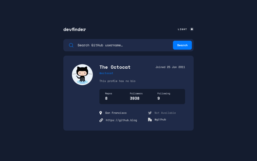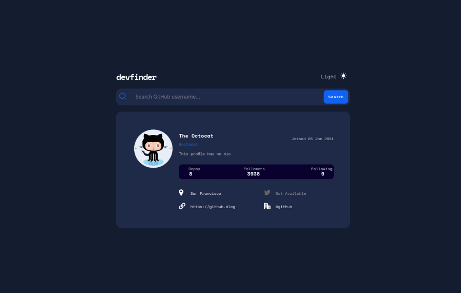
Design comparison
Solution retrospective
Hey everyone I completed another Junior Project with an API. This project was really fun to build as I have learned a way to toggle between themes. I also utilized a different solution to fetch the API than the previous advice generator project. Another concept I learned was being able to use the slice method in JavaScript to eliminate the unnecessary information that was retrieved from the API (specifically the date the users have joined). Please let me know if there is any way I could improve my code! Thank you in advance.
Community feedback
- @vanzasetiaPosted over 2 years ago
Hi, Trenton Bensheimer! 👋
Congratulations on finishing this challenge! 👏
Some suggestions from me.
- I notice the site has a horizontal scrollbar. I managed to remove the scrollbar by removing the
width: 100%
on thebody
element and thewidth
on the.container
as well. Settingwidth: 100%
on thebody
element is unnecessary because by default it is already filling the entire viewport width. For the.container
, I suggest only setting amax-width
. This way, thecontainer
can shrink if ever needed. Also, there's no point in setting thewidth
andmax-width
with the same value. - The indentation of your code is not consistent. It makes it hard for people to understand your code. So, I recommend having a code-formatter like Prettier to handle this automatically for you.
- For the
stats
andlinks
, I would recommend making them asul
. It is actually a list with four bullet points.
That's it! I hope this helps!
Marked as helpful0 - I notice the site has a horizontal scrollbar. I managed to remove the scrollbar by removing the
- @DanoBrozPosted over 2 years ago
Hi Trenton, I love that you've chosen a mobile-first approach and were able to set this up with VanillaJS. Firstly, as a friendly colleague FE developer, I'd suggest to be more aware of the colours, shadows and paddings provided in the design file, it gives a lot more value and refers how much you care about the project. Secondly, with APIs there's always a chance of some data not being provided, so I'd look into nullability with promises.
Marked as helpful0@tbensheimerPosted over 2 years ago@DanoBroz Thanks for your insight. I do want to mention that I chose not to download the figma or sketch files. All of this was done the best I can with none of those specific details to make the design pixel perfect.
0@vanzasetiaPosted over 2 years ago@tbensheimer Why did you choose to not download the design files? It will help you massively to write the styling. Also, it is one of the benefits or advantages of a PRO member. So, I don't know why you chose not to take the advantage of it.
1@tbensheimerPosted over 2 years ago@vanzasetia I have limited design downloads for the month and wanted to use them for other projects that are more complex. I am taking advantage of the feature
0@vanzasetiaPosted over 2 years ago@tbensheimer Fair enough! That's a good point. 👍
0 - @Ibarra11Posted over 2 years ago
Im not sure if you notice, but your app overflows in both the X and Y direction. As a result, there is a horizontal scrollbar and a vertical scrollbar. The issue is that the browser adds a default 8px margin to the body. I would suggest to include a CSS reset stylesheet, so you override the default browser styles and your app looks the same across different browsers.
Another thing I noted is your conditional logic. It's not incorrect ,but I might be more concise to use ternary operators. For Example,
bio.innerHTML = data.bio ? data.bio : 'this profile has no bio'; twitter.innerHTML = `<span class="icon"><img src="assets/icon-twitter.svg" alt="twitter icon" /></span> ${data.twitter ? data.twitter : 'Not Available'}`
For your classes, you are adding them though the classList.add but I think you can just do it straight from the HTML. It would be something like this
const twitterClass = `icon${data.twitter ? "" : " notAvailable"}`; twitter.innerHTML = `<span class=${twitterClass}><img src="assets/icon-twitter.svg" alt="twitter icon" /></span> ${data.twitter ? data.twitter : 'Not Available'}`
Marked as helpful0 - @Babacar-CissPosted over 2 years ago
hi look very nice but i have some remarks :
- when user not found it should print "user not found"
- some layout margin problem in the mobile version
1 - @Obatomi01Posted over 2 years ago
Well-done Trenton. You can try checking https://developer.mozilla.org/en-US/docs/Web/JavaScript/Reference/Global_Objects/Date/Date to make new date objects. You can call methods like getDay(), getMonth() on the prototype created from the Date Class in place of slice method. Good luck
0
Please log in to post a comment
Log in with GitHubJoin our Discord community
Join thousands of Frontend Mentor community members taking the challenges, sharing resources, helping each other, and chatting about all things front-end!
Join our Discord