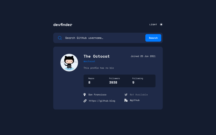
Design comparison
Solution retrospective
Embarking on this React project after a long hiatus was both a refreshing and challenging experience. Throughout the process, I found myself slightly diverging from the original design specifications. These deviations, however, were driven by a desire to enhance user experience and improve the overall functionality of the application.
Enhancements and Deviations:
Welcome Message Implementation:
One of the key deviations was the introduction of a welcome message. While not part of the initial design, this addition was aimed at creating an inviting first impression for users.
Custom Error Messages:
Another enhancement was the implementation of custom error messages. I recognized the importance of clear and informative feedback, especially in scenarios where users might make mistakes or overlook required inputs. By providing specific error messages when inputs are incorrect or missing, I aimed to guide users more effectively and reduce potential frustration. This change ensures that users receive immediate and helpful feedback, improving their overall experience.
Auto-focus on Input:
To streamline the user experience further, I employed the useRef hook to set the focus on the input field automatically when the page loads. This eliminates the need for users to manually click inside the input field, thus reducing an extra step and making the interaction more seamless.
Community feedback
Please log in to post a comment
Log in with GitHubJoin our Discord community
Join thousands of Frontend Mentor community members taking the challenges, sharing resources, helping each other, and chatting about all things front-end!
Join our Discord
