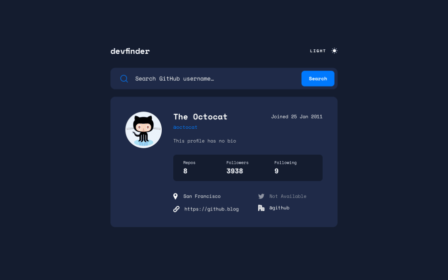
Design comparison
Solution retrospective
My first time working with an API. Would appreciate any feedback or criticism.
Community feedback
- @vanzasetiaPosted about 2 years ago
Hi, AceDub! 👋
Congratulations on completing this challenge! 🎉 Your solution looks pretty good! 😀 I like the idea of having a loading spinner! 👍
Here are some suggestions for improvements.
- I recommend adding
rel="noopener"to any anchor tags that havetarget="_blank". This is a security essential for external links. I suggest reading the web.dev article to learn more about this. - I would not recommend setting any
heightto thehtmlelement. I suggest treating thebodyelement as the webpage of the site. - I would also suggest not setting any
heightto thebodyelement. If you ever need to set a height then usemin-heightinstead. This way, thebodyelement is allowed to grow if ever needed. - Having the desktop layout at
1440pxis too late. So, I suggest adjusting the breakpoint of the media query. As a side note, the design sizes are telling you that the site should look like this at this specific screen size. They have nothing to do with the media queries. - The statistic should be a list with three bullet points. Also, the statistic categories and the statistic numbers should not be headings. Use
spaninstead (since it will be wrapped byli). Heading tags have meaning and are used to give structure to the page. You can think of headings like titles in documents. So, I recommend writing the HTML without any styling so that you can make a better decision on what HTML element you should use for the web content.
Overall, great work. The site even still looks good at
320pxwhich I would consider the smallest screen size.I hope this helps! Keep up the good work! 👍
0@vanzasetiaPosted about 2 years ago@AceDub
It's good to know that you realize that the users can get
403. Good job! 👍0 - I recommend adding
- @mubizzyPosted over 2 years ago
Excellent job on this challenge! your report has a few issues though:
- wrap everything in your body in
<main>or use semantics
2. it is a best practice to use both HTML 5 and ARIA landmarks to ensure all content is contained within a navigational region.
Hope it helps:)...don't forget to mark it as helpful 👍
You can get more details here...click here
0@AceDubPosted over 2 years agoHello @mubizzy,
I do believe I have everything in my
<body>wrapped in<main>. I took your advice and checked out the documentation you provided. Adding an ARIA landmark generated a new HTML issue for me which stated that it was unnecessary for the element.I appreciate you taking the time to provide some feedback!
0@mubizzyPosted over 2 years ago@AceDub am glad 😊 you found my post helpful 😊 😃 😀 Happy coding 😃 😊 😀
0 - wrap everything in your body in
Please log in to post a comment
Log in with GitHubJoin our Discord community
Join thousands of Frontend Mentor community members taking the challenges, sharing resources, helping each other, and chatting about all things front-end!
Join our Discord
