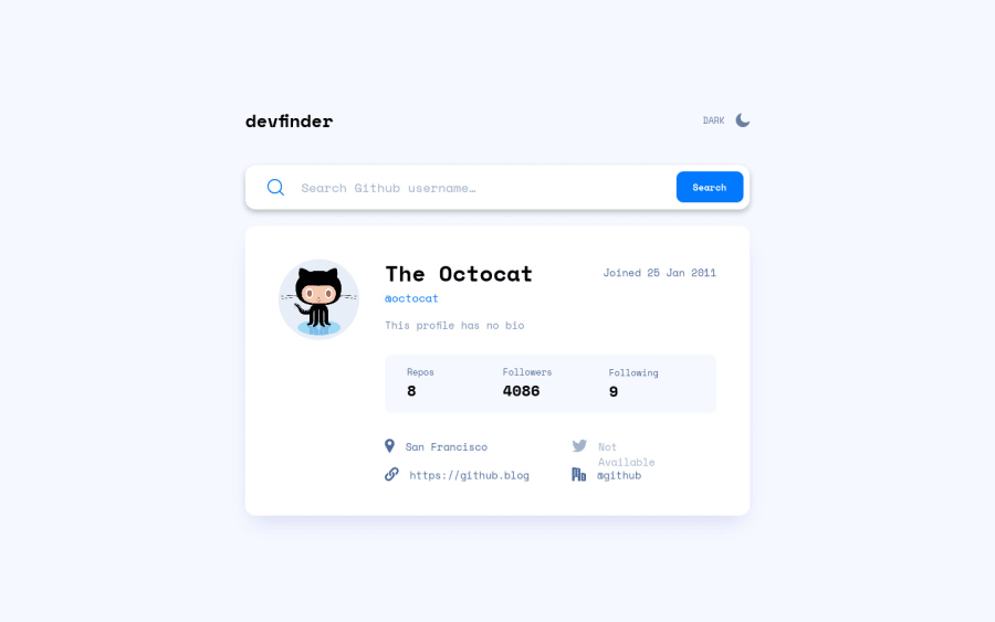


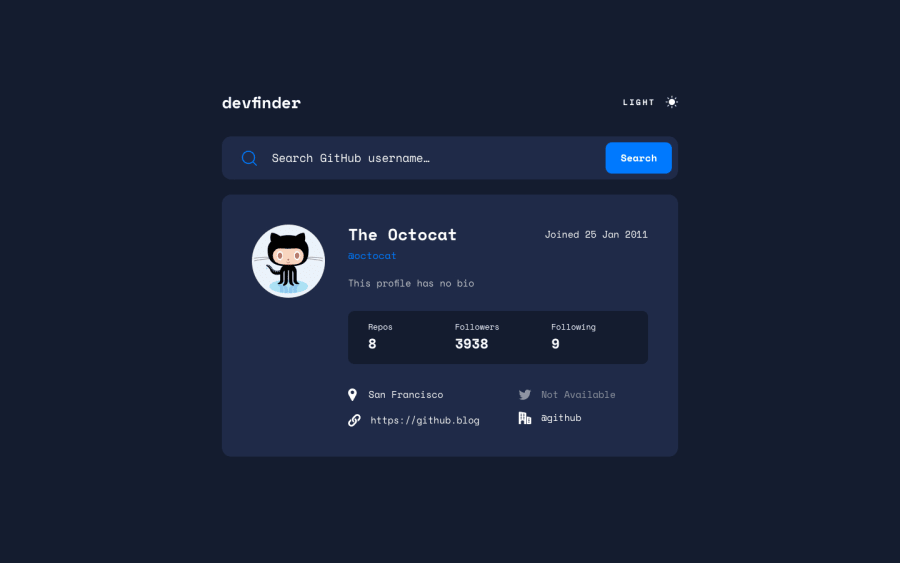
Design comparison
Solution retrospective
Let me know what I can improve. The sass felt a bit messy and there may be more to get better at.
Community feedback
- @pikapikamartPosted over 3 years ago
Hey, awesome work on this one. Layout in general looks great and it is responsive.
Jimmy Sweeney already gave feedback on this one, just going to add some suggestions as well:
- I would make the devfinder use
h1rather thanh2at the moment or just maybe use thesvgversion of the logo, is there asvgon this? - Your theme toggler works just fine, but it is limited for mouse users only because are not using proper element on it. Remember that interactive component needs to use interactive element, using
divmakes it not-accessible. The proper markup for the toggle would be to use 2 radio buttons that are inside afieldsetalong withlegendeither using "light" or "dark" as the text-content. I don't have a solution on this one though, but have a look at my rest api country solution check on how I use markup on the color theme toggler. - Also the
imgbeing use on the toggle should be hidden since it is only decoration. Decorative image must be hidden at all times for screen-reader users by usingalt=""and extraaria-hidden="true"attribute on theimgtag. - Nest the search-bar inside a
formso that it will be clear on the markup or site. imgon the search-bar is decorative, hide it using the method above.- Your
aria-describedByusage is not correct at the moment. If theinputis invalid, use the error-messageidas the value for thearia.
if ( input is wrong ) input.setAttribute("aria-invalid", "true"); input.setAttribute("aria-describedBy", id of the error-message); else input.removeAttribute("aria-invalid"); input.removeAttribute("aria-describedBy");- Another idea to implement to further to make it a accessible, is to have an
aria-liveelement that will announce either if there is a user found of if there is not or an invalid entry. This way, users will be informed right away on what happened after submitting the form. - User's image should be using the user's name as the value and not
profilesince it does not give any information at all. It could be like profile of many things. - Your
.user-statscould have usedulsince those are "list" of informations about the user or maybe atable? Hmmm - When wrapping a text-content do not just use
divto wrap it, use meaningful element like aptag if it just a regular text or heading tag if it is an heading. - Your .
user-linkscould have usedulas well, again, "list" of information. But instead of just usingul, nest it inside asectionsame with the.user-stats
<section>
  <h3 class="sr-only">User profile information</h3>
  <ul>
    { list of things }
  </ul>
</section>
Same markup for the last list items.
- Lastly, those icons on the last lists, hide them since they are only decoration.
Aside from those, great job again on this one.
Marked as helpful0@MarleyReynaPosted over 3 years ago@pikamart Thank you for the feedback! I am pretty sure I got through all of the suggested edits but had a few questions.
- What should I specifically set the id of my error message to? As for right now, I have the ID set to 'error-active'.
- Is the solution for the theme toggle I used accessible? I made the whole div tab-focusable and allowed it to toggle on the left and right arrow keys. Thanks!
0@pikapikamartPosted over 3 years ago@MarleyReyna Hey, sorry for the late reply :>>
- Yep, I saw the markup right now and you are using the
aria-describedByattribute properly and being linked to the error-message. Also, you don't need thearia-liveon the same error-message as well. Anaria-liveelement will only fire if and only if the text-content of the element changes. For example:
Input has no error:
<p aria-live=-"polite"> </p>Input has error, set your input error attributes, the
aria-invalidandaria-desscribedByand theptag should be like:<p aria-live="polite"> github username does not exist </p>The element will now announce the text-inside it, because at first, the text-content is empty then it is being populated that's why it will fire. Have a look at this simple accessible form that I created you can reference this though you will just have to work a bit more since you are using react.
- Nope, still not. As I said, using
divis not great for interactive components as they are not informative and does not really used at those. You can see the link that I send from my previous review where the toggle-theme markup of my rest-api challenge is.
Marked as helpful0 - I would make the devfinder use
- @sweenejpPosted over 3 years ago
Looks good Marley. One critique I have - could you put the infoUnavailable method within your loadUser method? That way you wouldn't have to put infoUnavailable in your JSX. That way you would have all of the data ready to be accessed when you render the component. Probably not a big deal, but I think it would make it a little cleaner.
Marked as helpful0


Please log in to post a comment
Log in with GitHubJoin our Discord community
Join thousands of Frontend Mentor community members taking the challenges, sharing resources, helping each other, and chatting about all things front-end!
Join our Discord