


Design comparison
Solution retrospective
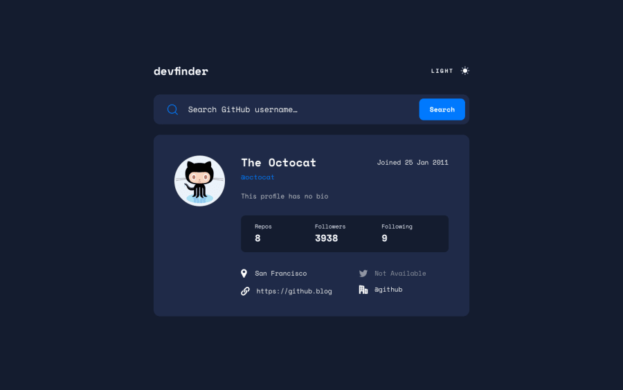
Hi community, just for feedbacks. I was able to get the project work based on the OS theme and I also added a spinner
Community feedback
- @elaineleungPosted over 2 years ago
Hi Oba, this looks really cool, and it's nice to be able to search for my GitHub profile 😂
Anyway, my comments are more about the CSS here: I noticed the component wasn't centered, and so I tried centering it in the inspector using
display: gridandplace-content: center, which went OK in the end after removing some padding top also. I then looked at your stylesheet and saw that you hadfont-size: 62.5%on yourhtmlselector, which was a bit puzzling to me, but it explains partly why even when using an 1.3rem fontsize, it doesn't look particularly big (that is, until I removed that line in the HTML and things look more or less the way they should). I would suggest not putting the font-size on the HTML unless you really need to, as that would change all the proportions for everything. Whenever possible, it's best to have it on the body selector, and also it's best to useremunits for font size; if you need it on HTML, do useremto be safe (the default is 1rem usually).Hope this helps a bit, and great work!
Marked as helpful2@DavidMorgadePosted over 2 years ago@elaineleung Hello Elaine,
Some people use
rem, to define all kind of sizes of the elements, changing the font-size on the html can change the value of rem for example, I always use this snippet to get my rems to be 1rem = 10pxhtml { /* 1rem = 10px */ font-size: 62.5%; } body { font-size: 1.6rem; }In this case he is adjusting the font-size depending on the size of the screen to directly change the size of rems so the application is more scalable, I wouldn't recommend this because is a bit hard to read and make future adjustment of your app.
But defining your rems at the start of your CSS is totally find IMO.
Marked as helpful1@elaineleungPosted over 2 years ago@DavidMorgade Thank you David for the correction and clarification, especially in being able to pick out what I wanted to highlight. I've just been too used to seeing people write odd things in their CSS especially with percentages, and I thought this was one of those instances and forgot about setting the base font-size in the html selector.
In this case, thank you also to @Oba for the lesson on
font-size: 62.5%as I've never seen it before so I just read up on it. Apparently it's something geared towards low-vision users, as using a percentage helps with scaling when they change their base font size as opposed to using a fixed size. I don't usually change the base font size, but I think this is a good lesson to learn and will be researching more about it!Marked as helpful0@Obatomi01Posted about 2 years ago@elaineleung Good day Elaine. My bad for the late reply. Thanks for your observation and your comment. David already highlighted what i did though.
1@Obatomi01Posted about 2 years ago@DavidMorgade Good day David. Thanks for the comment. You just highlighted what i did😂
1@elaineleungPosted about 2 years ago@Obatomi01 No worries, yes, incidentally because of this solution and because I started seeing a lot of FEM solutions using
font-size: 62.5%, I ended up doing more research on root font size and accessibility, and it seems there's a fair bit of debate surrounding the issue. Quite an interesting topic worth looking into!Marked as helpful0


Please log in to post a comment
Log in with GitHub
Join our Discord community
Join thousands of Frontend Mentor community members taking the challenges, sharing resources, helping each other, and chatting about all things front-end!
Join our Discord