


Design comparison
Community feedback
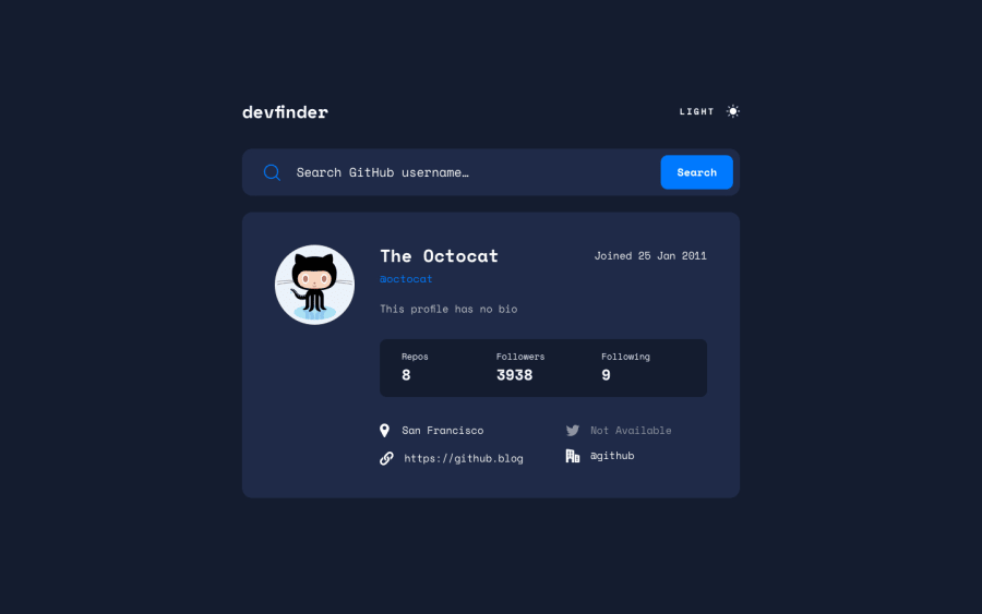
- @blakelyonsPosted about 1 year ago
Looks great! I like the fluidity of the UI. The only thing that threw me off a little is the Dark/Light switch. For me, I didn't really see the button at first because it said "Light" and the page was already in "light mode", so I was confused for a second. Maybe it's just me, but I think having it say "Dark" when in light mode and "Light" when in Dark mode would make it more clear that it's going to switch from light to dark and vice-versa.
Marked as helpful0@GokselSayilanPosted about 1 year ago@blakelyons Thank you for your supportive comment. I just followed the original design. That's why Light and Dark look that way
0@blakelyonsPosted about 1 year ago@GokselSayilan - I might be off here, but it looks to me like the original design has it saying "Light" when the background is dark? So I would assume it would read "Dark" when the background is light? It was confusing to me seeing "Light" with a light background because it's already light?
Marked as helpful0@GokselSayilanPosted about 1 year ago@blakelyons I've realized now. What you say is correct. I did it the exact opposite way. A theme check error. Thanks for your warning
1

Please log in to post a comment
Log in with GitHubJoin our Discord community
Join thousands of Frontend Mentor community members taking the challenges, sharing resources, helping each other, and chatting about all things front-end!
Join our Discord