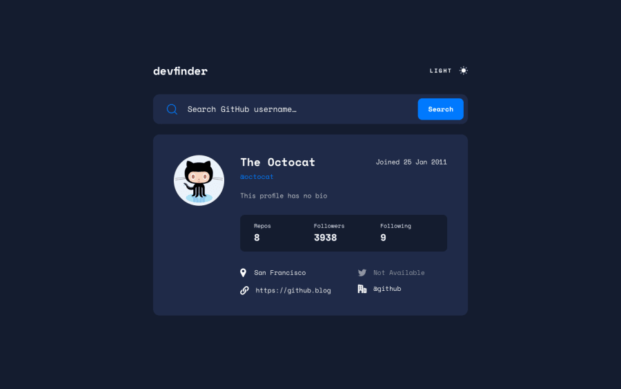
Design comparison
Community feedback
- @sergioreynosoPosted over 2 years ago
Good job! Very clean code. Some suggestions.
1- The dark mode toggle doesn't activate when I navigate using the tab button. This is not an ideal user experience for those with a disability.
2 - If you simulate a slow connection the applications just sits there until the fetch api finally loads the results. I would recommend giving the user a message that the information is loading.
3 - Match the top margin to the design.
4 - I really like the idea of a making a utility class to fetch data "FetchWrapper", just not sure why you use a class instead of just a regular function.
5 - I would recommend you break up searchUser function into sub functions. This would make the code more readable. For example where you commented '// format joined date', this could easily be made into formatJoinedDate(arg);. It's good practice to keep functions pure and not have them do too many things.
6 - As a next step I would recommend you break up your script file into modules. This goes back to point 5, it will make your code more readable.
Again, very good work and I hope these tips help. :-)
Marked as helpful0
Please log in to post a comment
Log in with GitHubJoin our Discord community
Join thousands of Frontend Mentor community members taking the challenges, sharing resources, helping each other, and chatting about all things front-end!
Join our Discord
