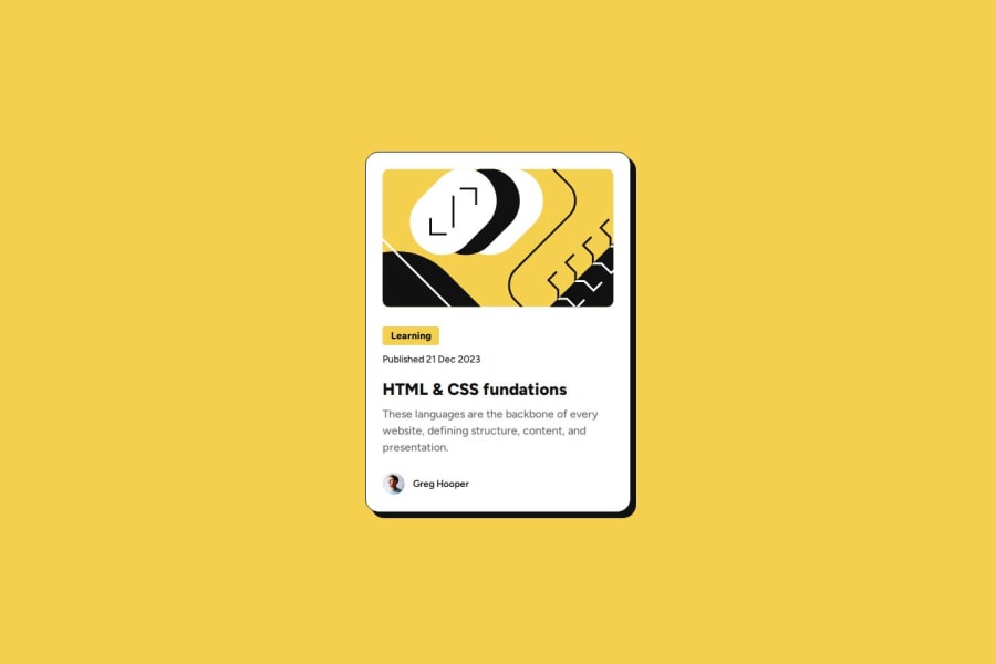
Design comparison
SolutionDesign
Solution retrospective
What are you most proud of, and what would you do differently next time?
I was able to solve the exercise faster, using flexbox seems very useful to me and every time I use it I understand it better, it is still not very clear to me the benefit of the units of measurement em and rem and why they are better than px, how can I see the difference and benefit
What challenges did you encounter, and how did you overcome them?Importing the fonts gave me problems, but it was solved when I identified the style of each one
What specific areas of your project would you like help with?In the transition that is made when moving the cursor, I don't know if it is in the correct place, or declared, because sometimes when the page loads all the objects move
Community feedback
Please log in to post a comment
Log in with GitHubJoin our Discord community
Join thousands of Frontend Mentor community members taking the challenges, sharing resources, helping each other, and chatting about all things front-end!
Join our Discord
