Submitted 10 months ago
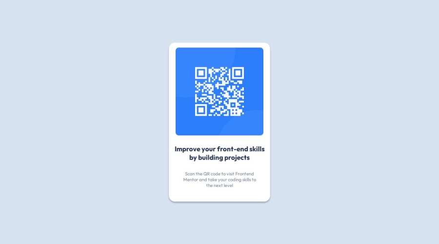
QR code card component made using vanilla HTML & CSS
@adhikariprayag
Design comparison
SolutionDesign
Solution retrospective
What are you most proud of, and what would you do differently next time?
I've made use of the CSS nesting feature and also created variables for the first time.
What challenges did you encounter, and how did you overcome them?I had problems with styling the box-shadow property and also adjusting the width of the card component. However, analyzing the Figma file solved the problems I faced.
What specific areas of your project would you like help with?I want help with the image width adjusting and the text width adjusting part.
Community feedback
Please log in to post a comment
Log in with GitHubJoin our Discord community
Join thousands of Frontend Mentor community members taking the challenges, sharing resources, helping each other, and chatting about all things front-end!
Join our Discord
