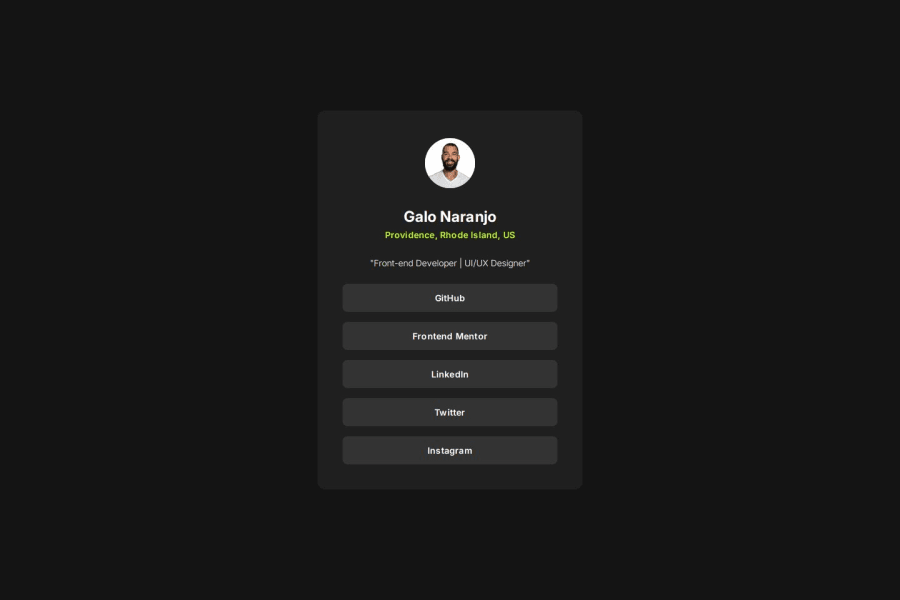
Design comparison
SolutionDesign
Solution retrospective
What are you most proud of, and what would you do differently next time?
Getting my workflow down. I've been really diligent about thoroughly editing files and making sure everything is buttoned before committing. Had a lot of fun playing and understanding transitions (cubic beziers, anyone?) and hover states.
What challenges did you encounter, and how did you overcome them?Understanding placement of `
Community feedback
Please log in to post a comment
Log in with GitHubJoin our Discord community
Join thousands of Frontend Mentor community members taking the challenges, sharing resources, helping each other, and chatting about all things front-end!
Join our Discord
