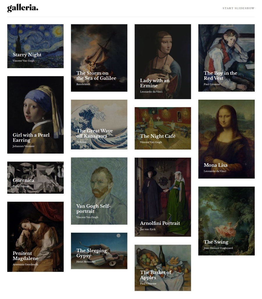
Design comparison
Solution retrospective
I think next time I would try to separate components into even smaller pieces.
What challenges did you encounter, and how did you overcome them?My biggest challenge was accessing/updating the state of the painting-index. I fixed that issue by using Pinia store. I also struggled with deploying the site, because the images were not rendering. That was happening because I put all my images and icons into /src/assets. I fixed that by putting them into {root}/public.
What specific areas of your project would you like help with?I wasn't able to find a good library for setting up a masonry layout like in the design, so I ended up adding custom CSS to achieve a similar look. It still doesn't look 100% the same as in the design tho. So any tips would be appreciated
Community feedback
Please log in to post a comment
Log in with GitHubJoin our Discord community
Join thousands of Frontend Mentor community members taking the challenges, sharing resources, helping each other, and chatting about all things front-end!
Join our Discord
