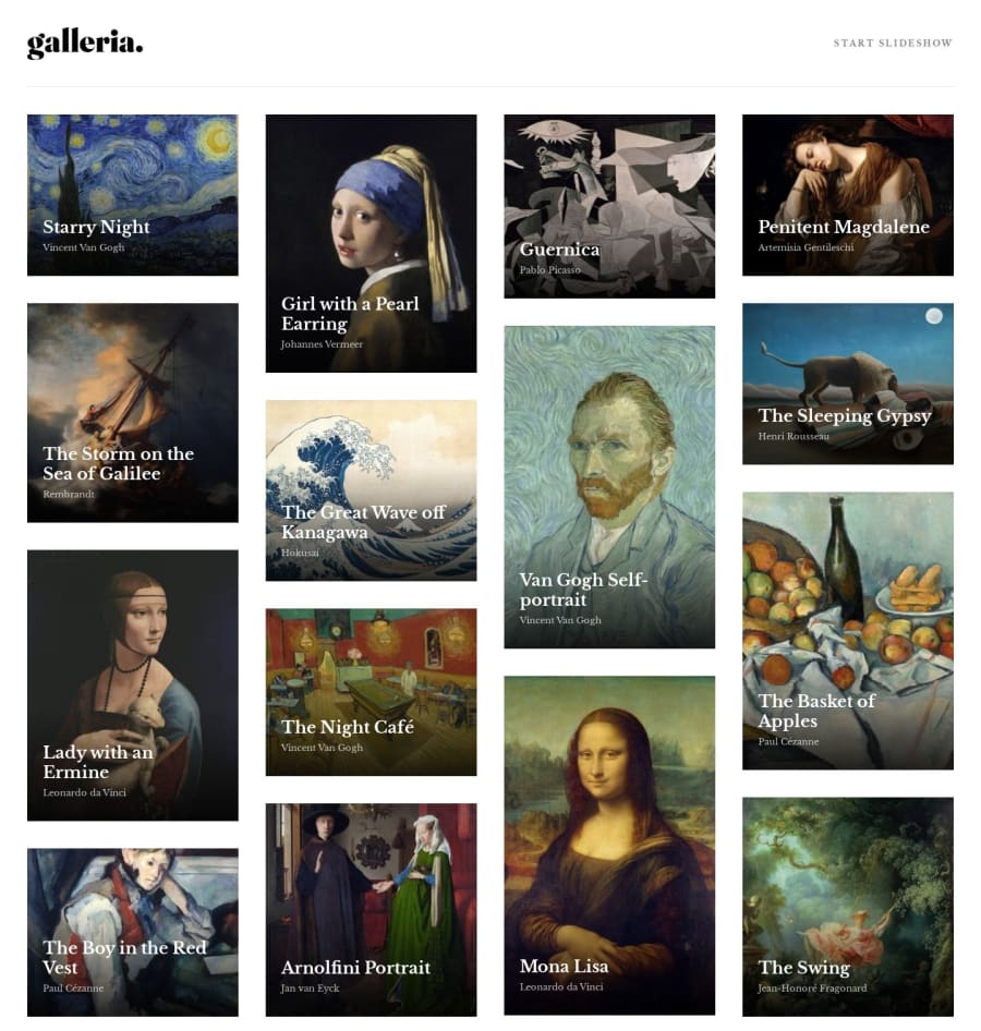
Design comparison
Solution retrospective
This was a fun app to develop, but there were some moments that were a bit challenging. Making some of the web pages fully responsive for all devices took a bit longer than I anticipated. I had to use multiple @media queries to resize all elements constantly to make sure everything fit in mobile and tablet. My only regret was not finding a way to minimize the use of these queries, since using too many can impact the performance of my app.
Another tricky situation was implementing the grid for the gallery images in the home page. I ended up using column-count instead of display: grid because column-count was capable of creating the exact same layout in the design. Using grid forced all gallery images to be placed in the same row.
Community feedback
Please log in to post a comment
Log in with GitHubJoin our Discord community
Join thousands of Frontend Mentor community members taking the challenges, sharing resources, helping each other, and chatting about all things front-end!
Join our Discord
