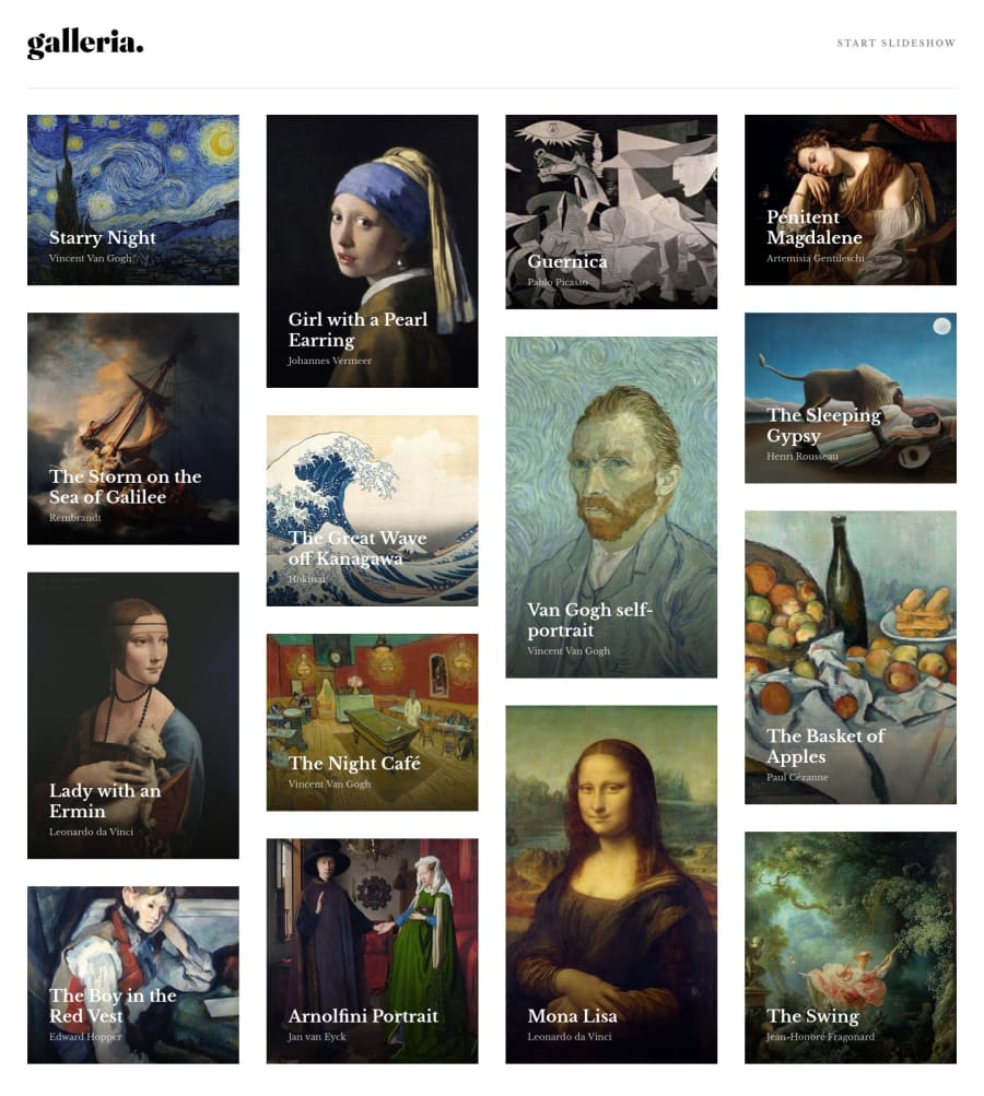
Design comparison
Solution retrospective
Hello! 👋
This ended up being a lot tougher than I expected, for a few reasons.
-
Because I pulled the data from the json file it kinda added an extra layer of complexity for me as I'm still getting to grips with React, and made styling the masonry layout a bit more confusing.
-
The masonry layout was pretty tough, decided to try and use grid as I'm inexperienced with it and need the practice. Originally tried to use a masonry library but it seemed a little buggy so didn't bother with it. Not sure what the best approach would be.
Overall happy enough with what I came up with, but feel like my code and react components could have been way more structured. Any feedback is welcome! 🙂
Community feedback
- @ribeiroAllisonPosted over 1 year ago
Hey Roan, congrats on finishing this project. It looks really nice!
Really liked the transition effect you designed, much better than hard cuts between pages. The name being hidden until hover was a nice touch too!
Also, the progression bar looks cool. I sure couldn't pull that off in my solution :) .
One thing I didn't quite get was the huge black bars around the page on bigger monitors. Was it a deliberate choice so you didn't distort the art on the detail page?
As for the slideshow, I supposed it had to roll out all the art pages automatically, at least that is how I designed it.
Anyway, nice work! I'll be sure to check your code on how to make these beautiful transitions.
Cheers, Allison
Marked as helpful2@RoanMacmillanPosted over 1 year ago@ribeiroAllison
Thanks for the feedback appreciate it!
Not sure what's going on with the black bars haha, definitely not intentional, will try to figure out what's going on there. 😅
Regarding the slideshow you're definitely right, checked out your solution and the auto play looks great. I think I will go back and improve my slideshow component as I would definitely take a slightly different approach now. I'm currently doing the minimal portfolio challenge and it has a similar slideshow type feature where I think I done things better.
If I can remember correctly I think I tried out react-transition-group for most of the transitions on this, maybe you could check it out!
0
Please log in to post a comment
Log in with GitHubJoin our Discord community
Join thousands of Frontend Mentor community members taking the challenges, sharing resources, helping each other, and chatting about all things front-end!
Join our Discord