Submitted over 2 years ago
fylo-landing-page-with-two-column-layout-master html & css
@AnouerMokrane
Design comparison
SolutionDesign
Solution retrospective
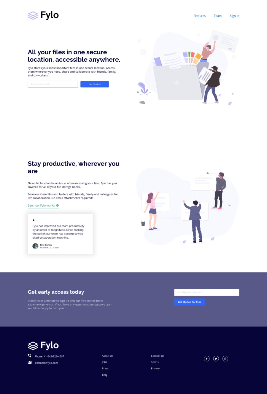
hello everyone, I'm having problems with distributing items(texts and imgs), any suggestions, please.
Community feedback
- @PhoenixDev22Posted over 2 years ago
Hi Anouer,
Congratulation on completing another frontend mentor challenge. Ihave some suggestions regarding your solution, if you don't mind:
HTML
- The logo's alternate text should not be
logo
. You can use the website's name as an alternate text. You may setalt=”Fylo"
. If you are going to leave the logo not wrapped by<a>
, it’s better to place it out the<nav>
as it does not navigate the user in anywhere(only an image).
- Images must have alt attribute. look up a bit more about how and when to write alt text on images. Learn the differences with decorative/meaningless images vs important content like
icon-phone, icon-arrow , icon-quotes
andicon-email
... are decorative. For decorative images, you set an emptyalt
to it with anaria-hidden=”true”
to remove that element from the accessibility tree. This can improve the experience for assistive technology users by hiding purely decorative images.
- Forms with proper inputs and labels are much easier for people to use. To pair the label and input, one way is an explicit label’s
for
attribute value must match its input’sid
value. Input fields without accompanying labels can lead to accessibility issues for those who rely on screen readers. If a screen reader comes across an input field without a label it will try to find some accompanying text to use as the label. (To hide the label visually but present for assistive technology, you may usesr-only
class )
- Profile images like that avatar are valuable content images, not decorative .For the alternate text of the avatar testimonial should not be user , it’s meaningless. You can use the avatar’s name
alt=" kyle burton"
.
- For the testimonial , you may use
<blockquote>, <figure>, <figcaption>
- You have used <br> , using
<br>
is not only bad practice, it is problematic for people who navigate with the aid of screen reading technology. Screen readers may announce the presence of the element. This can be a confusing and frustrating experience for the person using the screen reader. You can read more in MDN
- Avoid using
<br>
to create margins between paragraphs, wrap them in<p>
elements and use theCSS margin
property to control their size.
- Use the
<nav >
landmark to wrap the footer navigation witharia-label=”secondary “
oraria-label=”footer”
. A brief description of the purpose of the navigation, omitting the term "navigation", as the screen reader will read both the role and the contents of the label. Thenav
element in the header could use anaria-label="primary"
oraria-label=”main”
attribute on it. The reason for this is that, you should add thearia-label
for a nav element if you are using the nav more than once on the page.you can read more in MDN
- Just keep in mind that you should usually use semantic HTML in place of the div tag unless none of them (the semantic tags) really match the content to group together.* For example , You may use the <address> tag to wrap the contact information for
class="foot-info"
the author/owner of a document or an article (email and phone number.)
- In this instance
<li>About Us</li>
, it does not navigate the user anywhere. You should use interactive element<a>
, for example:<li><a href=”#”>About Us</a></li>
- Links must have discernible text. The social links wrapping the icons must have
aria-label
orsr-only
text indicate where the link will take the user. Your icons are purely decorative, you'll need to manually add an aria-hidden attribute to each of your icons.
<ul class=”social” > <li><a href=”#” aria-label="Visit our facebook<i class="fa-brands fa-facebook-f "aria-hidden=”true”></i></a></li> <li><a href=”#” aria-label="Visit our twitter"> <i class="fa-brands fa-twitter" aria-hidden=”true”></i></a></li> <li><a href=”#” aria-label="Visit our instagram"> <i class="fa-brands fa-instagram" aria-hidden=”true”></i></a></li> </li> </ul>
You may want to have a look at my solution , it might help
Aside these , you did great work. Hopefully this feedback helps.
Marked as helpful1 - The logo's alternate text should not be
Please log in to post a comment
Log in with GitHubJoin our Discord community
Join thousands of Frontend Mentor community members taking the challenges, sharing resources, helping each other, and chatting about all things front-end!
Join our Discord