Not Found
Not Found
Not Found
Not Found
Not Found
Not Found
Not Found
Not Found
Not Found
Not Found
Not Found
Not Found
Not Found
Not Found
Not Found
Not Found
Not Found
Not Found
Not Found
Not Found

Submitted

fylo-landing-page-with-two-column-layout-master

@preciousoduh

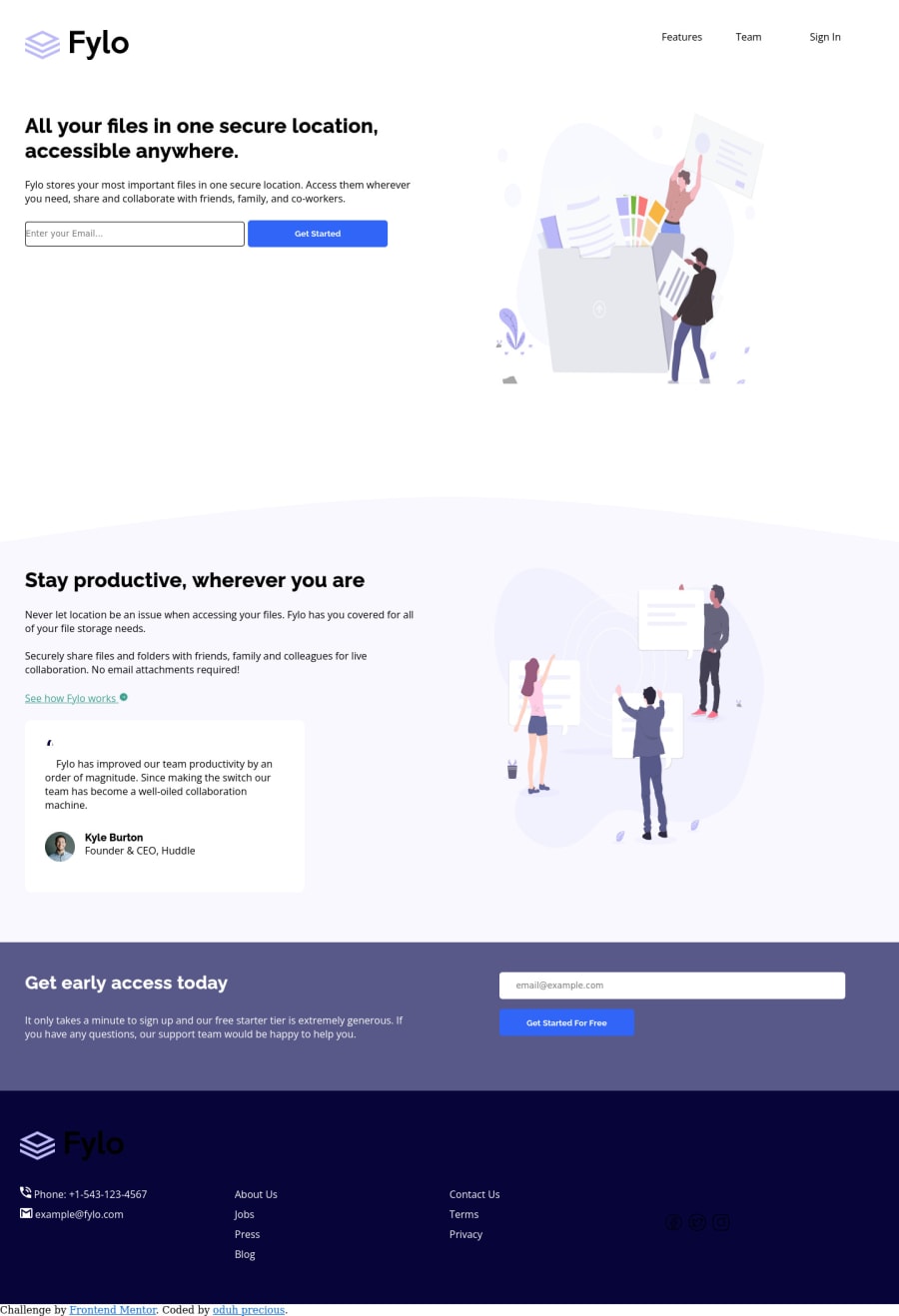
Desktop design screenshot for the Fylo landing page with two column layout coding challenge

This is a solution for...

  • HTML
  • CSS
2junior
View challenge

Design comparison


SolutionDesign

Solution retrospective


hey everyone, hope you're doing good. had a lot of fun doing this but struggled with my background positioning after racking my brains finally did it. if you have any suggestion on better ways I could have any anything please do leave a comment thank you.

Community feedback

PhoenixDev22 16,950

@PhoenixDev22

Posted

Hello oduh precious,

Congratulation on completing another frontend mentor challenge.

Excellent work! I have some suggestions regarding your solution if you don't mind:

HTML

  • The logo's alternate text is needed on the logo image . You can use the website's name as an alternate text. You may set alt=”Fylo".
  • In class="nav-header,`<li> elements must be contained in a <ul> Put your links within an unordered list<ul> structure so that a screen reader will read out how many things are in the list to give visually impaired users the most information possible about the contents of the navigation. Then wrap them by <a>, in this instance they are not clickable and don't navigate the user.
             <ul class="navigation flex" aria-label="primary">
	        <li><a href="#" class=" ">Features</a></li>
	        <li><a href="#" class=" ">Team</a></li>
	        <li><a href="#" class=" ">Sign In</a></li>
	      </ul>

  • Wrap your sections within <main> landmark. <header >should live outside the <main>.
  • Use <form> to wrap forms instead of generic divs’ and spans.
  • Heading elements are not in a sequentially-descending order. For example: * For example, using an <h1> element for your section title and then using<h4> element for the avatar’s name, that will cause the audit to fail because the <h3> level is skipped:*To fix that, make all heading elements follow a logical, numerical order that reflects the structure of your content.
  • Forms with proper inputs and labels are much easier for people to use. To pair the label and input, one way is an explicit label’s for attribute value must match its input’s id value. Input fields without accompanying labels can lead to accessibility issues for those who rely on screen readers. If a screen reader comes across an input field without a label it will try to find some accompanying text to use as the label. (To hide the label visually but present for assistive technology, you may use sr-only class )
  • Profile images like that avatar are valuable content images, not decorative .For the alternate text of the avatar testimonial should not be ** avatar-testimonial** . You can use the avatar’s name alt=" kyle burton".
  • For the testimonial , you may use <blockquote>, <figure>, <figcaption>
  • Use the<nav > landmark to wrap the footer navigation with aria-label=”secondary “ or aria-label=”footer”. A brief description of the purpose of the navigation, omitting the term "navigation", as the screen reader will read both the role and the contents of the label. Thenav element in the header could use an aria-label="primary" or aria-label=”main” attribute on it. The reason for this is that, you should add the aria-label for a nav element if you are using the nav more than once on the page.you can read more in MDN
  • Never use <div> and <span> alone to wrap a meaningful content. Just keep in mind that you should usually use semantic HTML in place of the div tag unless none of them (the semantic tags) really match the content to group together.* For example , You may use the <address> tag to wrap the contact information class="footer-one for the author/owner of a document or an article (email and phone number.)
  • You have used <br> , using <br> is not only bad practice, it is problematic for people who navigate with the aid of screen reading technology. Screen readers may announce the presence of the element. This can be a confusing and frustrating experience for the person using the screen reader. You can read more in MDN
  • Do not use <br> to create margins between paragraphs, wrap them in <p> elements and use the CSS margin property to control their size. If you wish to limit the width of them , you may use max-width rule.
  • Links must have discernible text. The social links wrapping the images must have aria-label or sr-only text indicate where the link will take the user. Then you set aria-hidden =”true” to the images to be ignored by assistive technology . You may want to have a look at my solution , it might help

Last , I really recommend to check the solution report, and using Devtools in Chrome and using lighthouse.

Aside these, Great work on this one.

0

@preciousoduh

Posted

@PhoenixDev22 oh this is so helpful thank you so much for taking your time to explain all this to me. I will read more on aria label. Thanks alottttt Hope you have a great day!!!

0

Please log in to post a comment

Log in with GitHub
Discord logo

Join our Discord community

Join thousands of Frontend Mentor community members taking the challenges, sharing resources, helping each other, and chatting about all things front-end!

Join our Discord