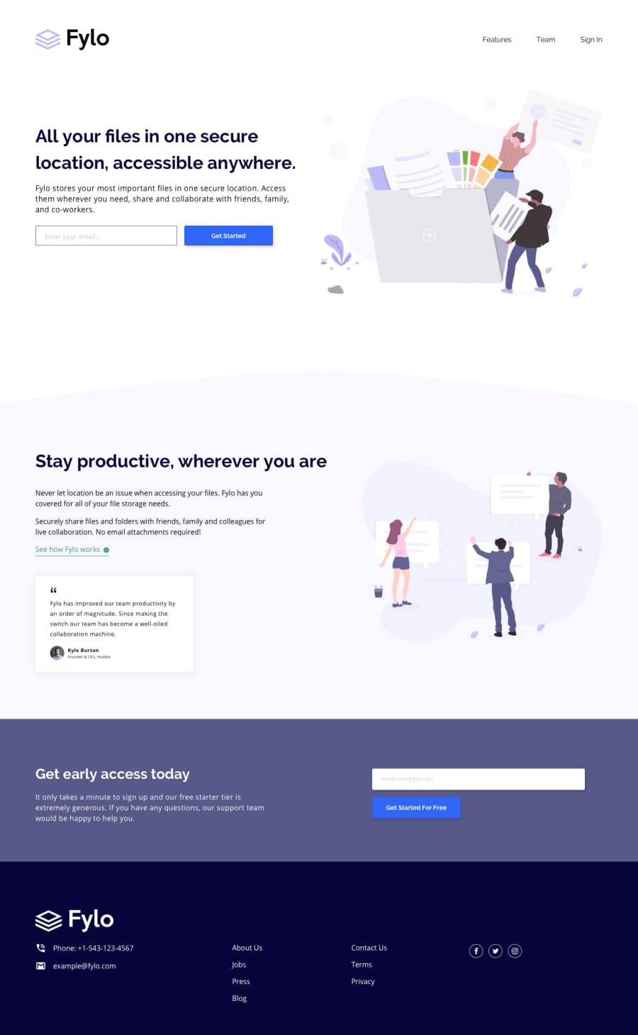
Design comparison
Solution retrospective
ill be glad to know your feedback ^^
Community feedback
- @javascriptor1Posted over 1 year ago
Hi Razan ,
Good job. Here is my feedback on your solution: -It seems you mixed the fonts in the design. Headings, Call-to-actions, and Header Navigation should be in Raleway as per the style guide. To help you find out font family types easily, there is an excellent Chrome extension called Fonts ninja which can identify fonts on your web page. -There is an overflow on the x-axis both in mobile and desktop designs. -Input forms do not function properly. When hovering over the element, there is a placeholder predefined already. When I type an email, it's written on top of the placeholder. Then the forms submit even when the email is invalid. No Checking is available. -Use nav elements and wrap all li header items in anchor tags as they are links.
<ul>
<li><a href="#">Features</a></li>
</ul>
-Active state is not done for this element [See how Fylo works ]
- in getting early access and footer sections, the background color should cover the full width. Remove any paddings or margins on the left.
I hope this help.
Keep coding 🚀
0
Please log in to post a comment
Log in with GitHubJoin our Discord community
Join thousands of Frontend Mentor community members taking the challenges, sharing resources, helping each other, and chatting about all things front-end!
Join our Discord
