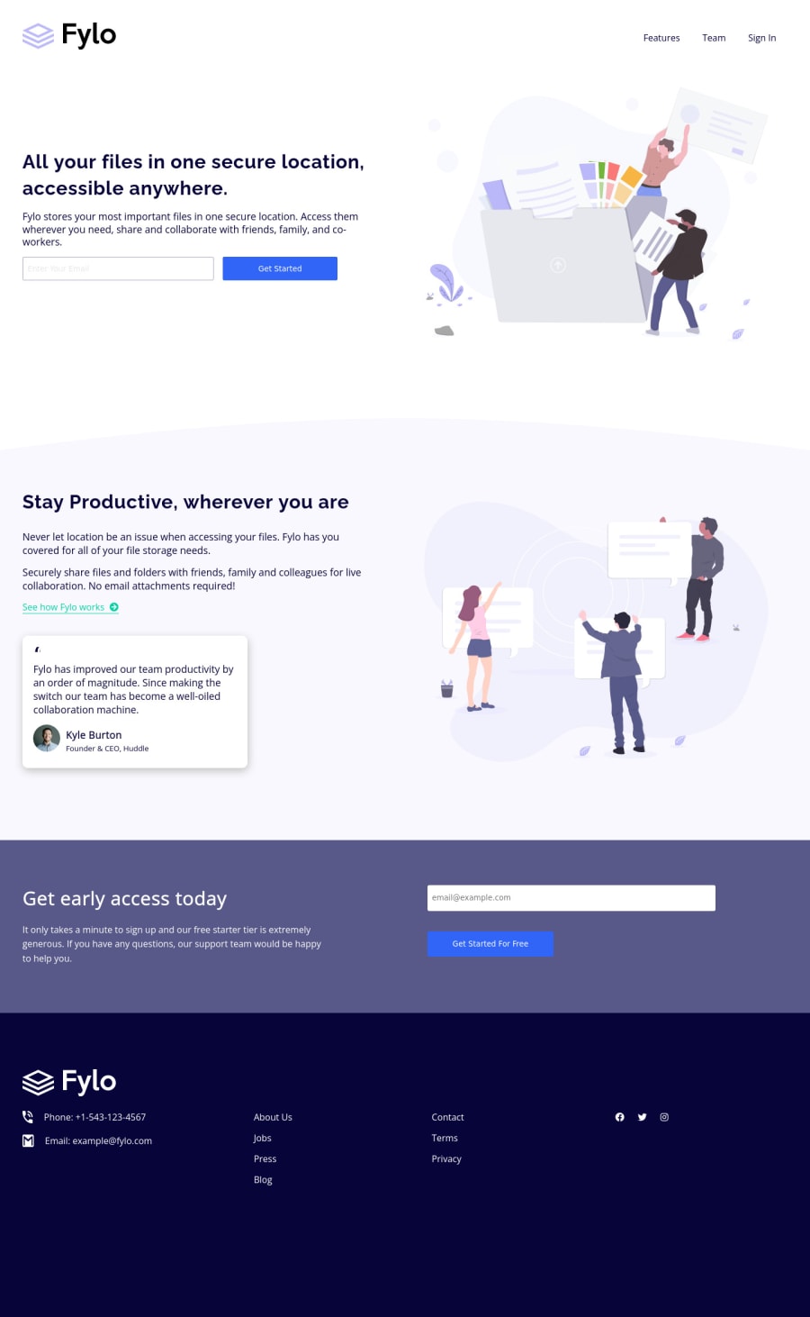
Fylo-landing-page-with-two-column-layout-challenge | flex | grid
Design comparison
Solution retrospective
i'm very happy if you can give me some advice to improve my skills. thank you.
Community feedback
- @brodiewebdtPosted almost 3 years ago
You did a pretty good job on this. The submit button can use some work, they are a little small at some resolutions. The phone and mail Icons are distorted at some resolutions as well. You also want to research form validation as you will need to use it later on.
Add Fylo to the ALT text on your logo images, and add aria-label="Facebook" etc.. to the A tags surrounding your social media icons. That will clear the accessibility warnings.
Download AXE DevTools and you can clear accessibility warnings while you code. https://www.deque.com/axe/devtools/
Hope this helps.
Marked as helpful1
Please log in to post a comment
Log in with GitHubJoin our Discord community
Join thousands of Frontend Mentor community members taking the challenges, sharing resources, helping each other, and chatting about all things front-end!
Join our Discord
