Design comparison
Community feedback
- @Islandstone89Posted 11 months ago
HTML:
-
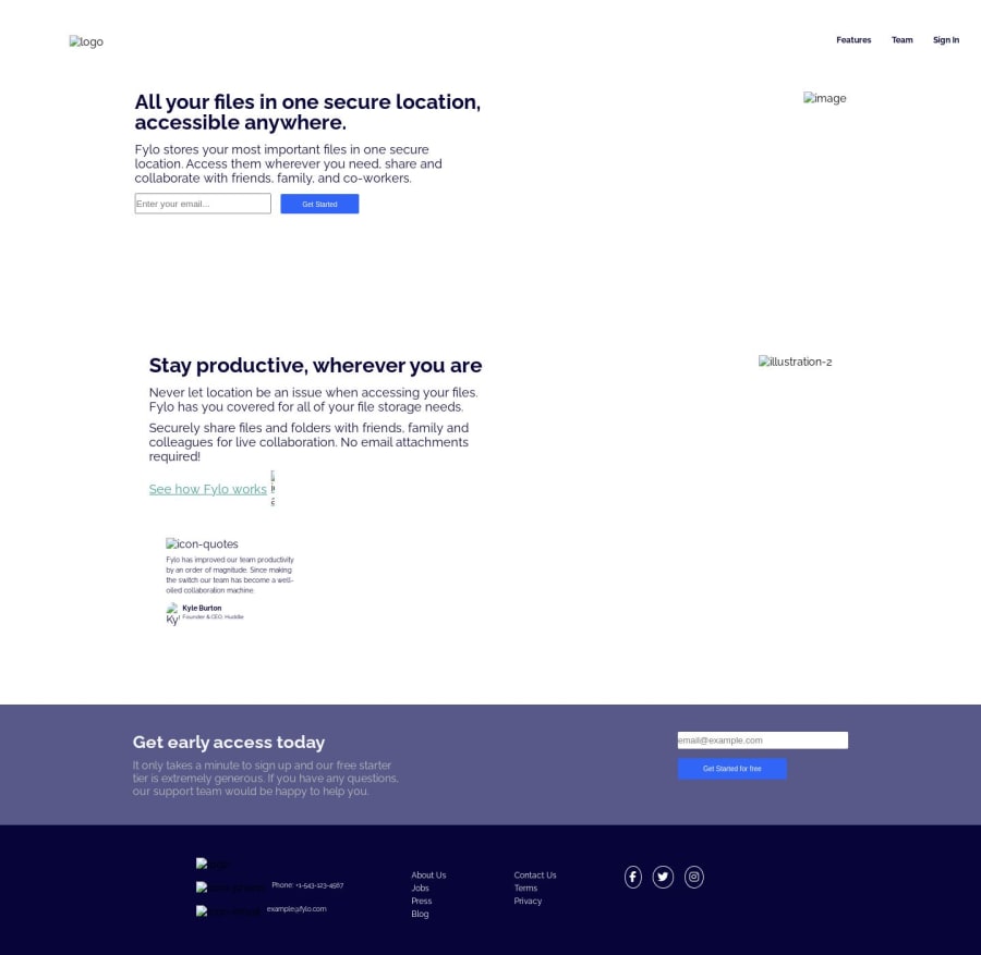
Your file reference path is incorrect, hence the images are not showing. Remove
./images/and they should appear. -
There should only be one
<h1>on a page. -
Decorative icons and images should have empty alt text:
alt="". -
Use the appropriate semantic HTML elements whenever needed. Instead of
<div class="header">, use<header>- the<nav>should be inside the<header>, not the other way around. The main content needs to be wrapped in a<main>, and the dark purple section in a<footer>. -
Remember, you don't need to write
flex-direction: row, as that is the default value.
CSS:
-
It's good practice to include a CSS Reset at the top.
-
Never set font size in px. This is bad for accessibility, as it prevents the font size from scaling with the user's default setting in the browser. Use rem instead.
-
line-heightmust also never be inpx. -
Do not set fixed widths or heights.
-
I would use Grid instead of Flexbox on the
mainandfooterlayouts. -
Media queries should be in rem instead of
px.
Marked as helpful0 -
Please log in to post a comment
Log in with GitHubJoin our Discord community
Join thousands of Frontend Mentor community members taking the challenges, sharing resources, helping each other, and chatting about all things front-end!
Join our Discord
