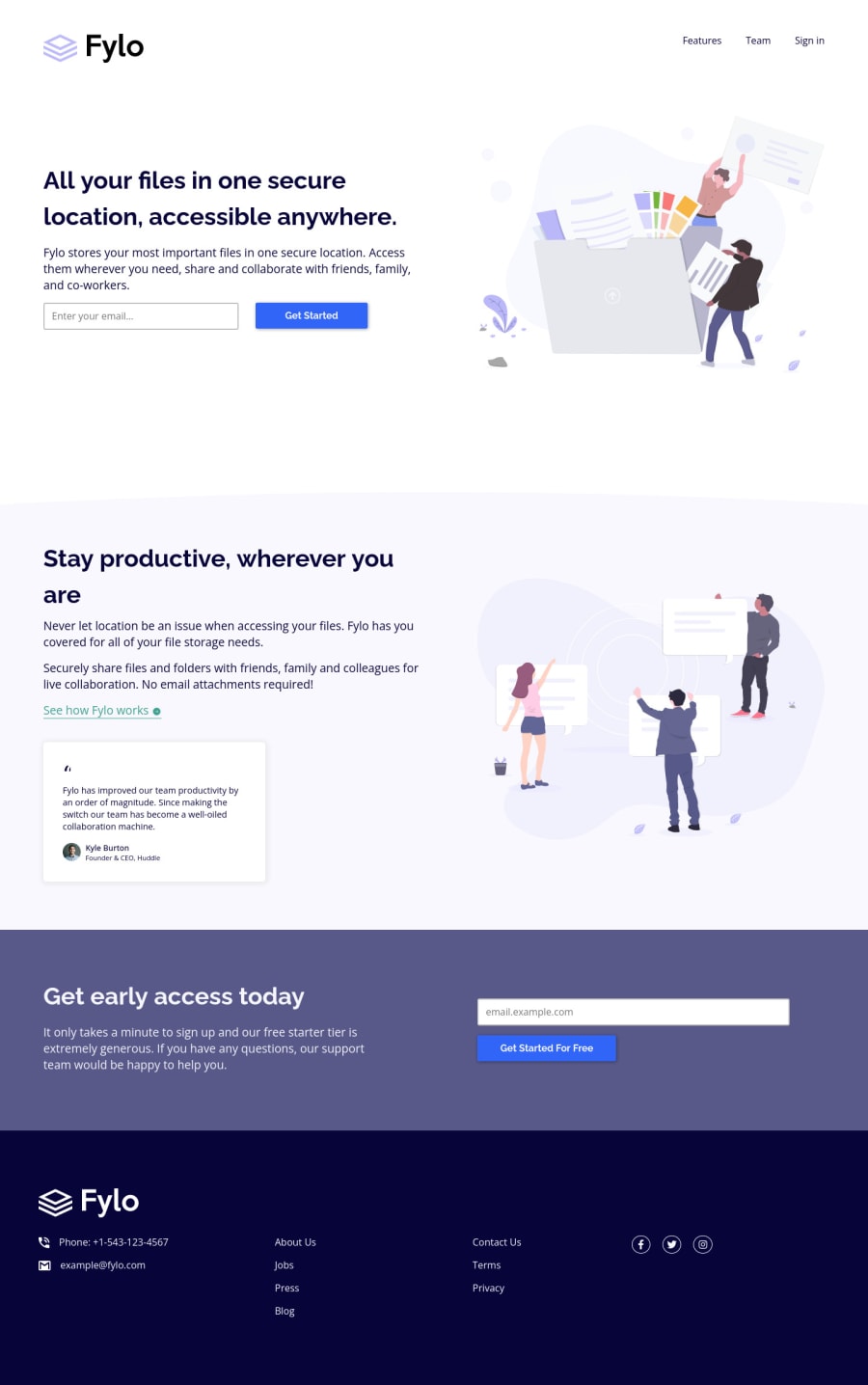
Fylo-Landing-Page-with-Two-Column-Layout built with flexbox and grid
Design comparison
Solution retrospective
It took a while to get the error message for the email field. Is there a better and faster way to get it?
Community feedback
- @PhoenixDev22Posted about 2 years ago
Hi ChinatuL,
Great job on this one. I have some suggestions regarding your solution, if you don't mind:
HTML
- If you are going to leave the logo not wrapped by
<a>
, it’s better to place it out the<nav>
as it does not navigate the user in anywhere (only an image).
- look up a bit more about how and when to write alternate text on images. Learn the differences between decorative/meaningless images vs important content . For decorative images, you set an empty
alt
to it with anaria-hidden=”true”
to remove that element from the accessibility tree. This can improve the experience for assistive technology users by hiding purely decorative images.
- Profile images like that avatar are valuable content images, not decorative. For the alternate text of the avatar testimonial should not be avatar. You can use the avatar’s name
alt=" kyle burton"
.
- You may use like to use
<address>
tag to wrap the contact informationcontact-info
for the author/owner of a document or an article (email and phone number). By adding semantic tags to your document, you provide additional information about the document, which aids in communication.
-
You shoud use the
<nav >
landmark to wrap the footer navigation. Then you should addaria-label=”secondary “
oraria-label=”footer”
to it . A brief description of the purpose of the navigation, omitting the term "navigation", as the screen reader will read both the role and the contents of the label. Thenav
element in the header could use anaria-label="primary"
oraria-label=”main”
attribute on it. The reason for this is that, you should add thearia-label
for a nav element if you are using the nav more than once on the page.you can read more in MDN -
The alternate text of the footer’s logo should not be
footer logo
, you may set alt=”Fylo". Use the website's name as an alternate text. Remember that a website-logo is one of the most meaningful images on a site so use proper alt for it.
- Add aria-live attribute on that error message
class="error-message
to make sure that error message will be presented to everyone, including it being read out to ** screen reader users**.
- Great work adding aria-hidden to the social icons to be ignored by screen readers to avoid redundancy and repetition
I have a question : why did you use
title
andaria label
together? aria-label for assistive technology users and title to display the tooltip on the hover for visual usersOverall , Excellent work! Hopefully this feedback helps.
0 - If you are going to leave the logo not wrapped by
Please log in to post a comment
Log in with GitHubJoin our Discord community
Join thousands of Frontend Mentor community members taking the challenges, sharing resources, helping each other, and chatting about all things front-end!
Join our Discord