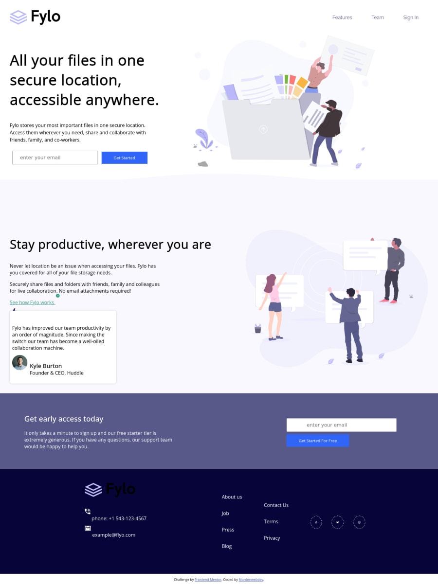
fylo-landing-page with html and CSS flexbox
Design comparison
Solution retrospective
Hi, developers please provide any feedback it will be helpful. and don't mention there is no email validation. because I did not use JavaScript in this project. Just focusing on layout.
Community feedback
- @pikapikamartPosted almost 3 years ago
Hey, awesome work on this one. The layout in desktop looks fine, although there is an extra space on the right side thus creating a horizontal scroll. Resizing the screen, the layout responds but not that well since if you go to at like 1010px upwards, the content are stuck on the left side and not really responding. For mobile state, the layout is fine but there is a huge horizontal scrollbar as well.
Here are some suggestions for the site:
- Adding a
max-width
on thebody
tag would be nice. If you try zooming out on your screen, you will see that the overall content are just stretching as the screen changes. Themax-width
will prevent it since it will limit the content's width and also add amargin: 0 auto
so that it will be centered. - On this, the
main
should be outside theheader
tag so that it will be treated as a primary landmark:
<header /> <main /> <footer />
- The
header
should only contain the topmost part of the site, including the site-logo, navlinks and some other controls. - The site-logo could be left out from the
nav
since it is not being treated as a link. If you insist keeping it, then wrap theimg
bya
tag with a properaria-label
orsr-only
text. - Add a
aria-label="primary"
on thenav
, this will make sure that it stays unique since I will be suggesting another usage ofnav
on this layout. - Remember that a website-logo is one of the meaningful images on a site so use proper
alt
for it. Use the website's name as the value likealt="fylo"
. - When using
img
tag, you don't need to add words that relates to "graphic" such as "logo, image" and others, sinceimg
is already an image so no need to describe it as one. - Whenever there is
input
on the site that submits data, always wrap it in aform
tag to make it more semantic. - Also, you can have this snippet of mine to reference for accessible form and validation.
- When there is a
button
that submits theform
, always usetype="submit"
. Remember that when abutton
is placed inside aform
element, it defaults totype="submit"
. So imagine if you have a close-button inside theform
without specifyingtype="button"
clicking the close-button will submit theform
. Be aware of this kind of scenarios. - Almost all the images being used on the site are just decorative except for the site-logo and the testimonial person-image. Decorative images should be hidden for screen-reader at all times by using
alt=""
andaria-hidden="true"
to theimg
tag or onlyaria-hidden="true"
if you are usingsvg
instead ofimg
tag. - On the
.curv
selector, this is the curve background-image, this is the one causing the horizontals scrollbar. To fix, just addwidth: 100%
on it so that it will scale well. - For the testimonial card, you can use this markup below to make it more easier for screen-reader users to navigate through it:
<figure> <blockquote> <p> {qoute in here}</p> </blockquote> <img src="" alt={person name}> <figcaption> person name <p> person role </p> </figcaption> </figure>
- Person's
img
should have used their name as thealt
value since in a testimonial, it is all about the person so it makes sense to make their image visible for all users by using their name as thealt
value.
FOOTER
- The
footer
tag should be wrapping the bottom-most part of the site and not the.attribution
, you can include the.attribution
inside thefooter
but make sure that thefooter
wraps the correct content. - For the site-logo, you could have used the
svg
code of the logo and use thefill
attribute to set it to color white so that it will be visible. - The site-logo as well should not be included in the
ul
tag that you used since that site-logo is a content of its own and not a list item. - Those 7 links could have live inside a
nav
since those are still your navigational links. Also, since they are all related, using a singleul
tag to wrap those will be really great:
<nav aria-label="footer"> <ul> <li> <a href=""></a> </li> </ul> </nav>
Use
a
tag for each since they are all acting as links.- Each
a
tag that wraps the social-media icon should have eitheraria-label
attribute orsr-only
text inside it, defining where the link would take them. For example, you should usefacebook
as the value if the link would take the user to facebook. - Lastly, addressing the styling issue of the site. From the breakpoint to the zooming out of the screen.
Aside from those, great job again on this one.
0 - Adding a
Please log in to post a comment
Log in with GitHubJoin our Discord community
Join thousands of Frontend Mentor community members taking the challenges, sharing resources, helping each other, and chatting about all things front-end!
Join our Discord