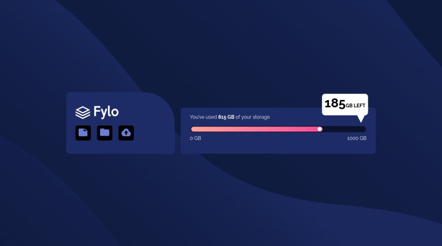
fylo-data-storage-component-master + animation, I have 1 problem tho.
Design comparison
Solution retrospective
For the desktop view, I couldn't give the "185 GB" pup notification white box the extension it has, I could only do the regular rectangle notification box. So I tried putting a triangle on the bottom for the desktop view but it didn't come out well, so I was forced to leave it like that. Can anyone tell me the best way to do this? Please check out the desktop view of my project, I'll appreciate your feedback.🙏🏽🔥❤️
Community feedback
- @chukwudobe-MicahPosted about 2 years ago
You're so kind! What you mean is that I should use rotate: -35px; right? and I shouldn't use transform, is this right?
0 - @shivakumar-ui-maxPosted about 2 years ago
U did well it just small issue . To overcome this issue I will suggest u few properties. Use below property. Ex: Rotate : -35deg this just example. Some time "transform: rotate" property not works because it have specific order to overcome follow above example. Maximum it works , if doesn't work pardon me.
I hope you Understand what I'm saying. Good job, keep doing 👏.
0
Please log in to post a comment
Log in with GitHubJoin our Discord community
Join thousands of Frontend Mentor community members taking the challenges, sharing resources, helping each other, and chatting about all things front-end!
Join our Discord
