Design comparison
Solution retrospective
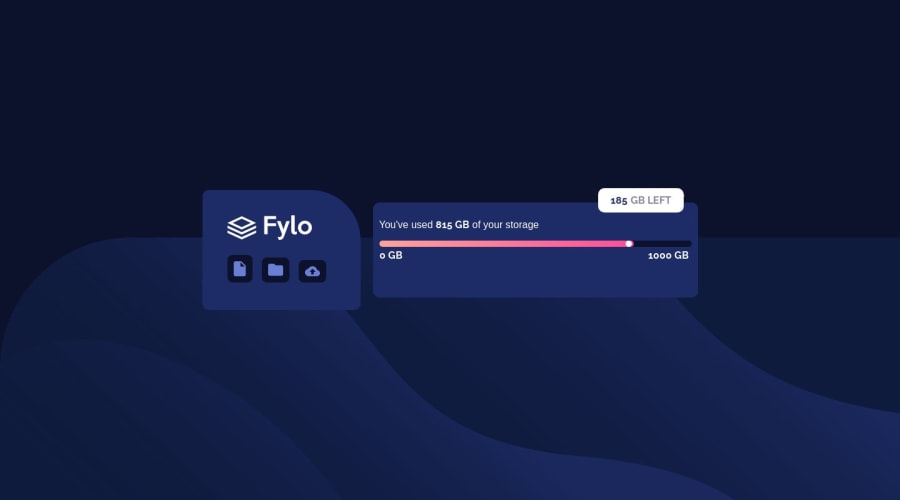
Hey guys, just finished this challenge. I used Reactjs to build it, being the first project using React I have learned and made a few mistakes which I would really love for anyone to point out and show me the right correction. All corrections will be much appreciated.
Community feedback
- @darkseid7Posted over 1 year ago
Great job on your design! Just a small suggestion to further enhance the visual appeal and alignment of the components. Please consider aligning the two components to ensure a consistent and balanced layout. In particular, it would be beneficial to increase the font size of the '185GB' component, making it more prominent and easily readable.
To assist you in this process, I recommend utilizing Figma, a powerful design tool that allows you to visualize and adjust the width and height of the components. This will help you achieve precise alignment and ensure a polished final result.
Keep up the excellent work, and good luck with your design endeavors!
0
Please log in to post a comment
Log in with GitHubJoin our Discord community
Join thousands of Frontend Mentor community members taking the challenges, sharing resources, helping each other, and chatting about all things front-end!
Join our Discord