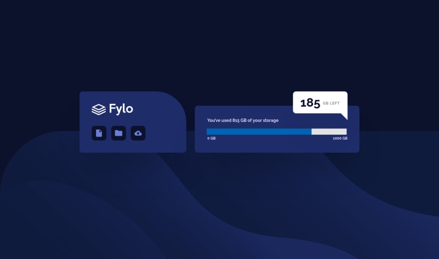
Fylo-data-storage-component HTML/CSS
Design comparison
Solution retrospective
Hello guys,
At first it seems like a very simple project, but it has few tricky bits. Progress bar is quite hard to customise. And background keeps sliding sideways on the mobile version. It was quite a challenge =)
Is there a way to test your mobile solution against the design? The same way I check it for the desktop version, with vertical line?
Community feedback
- @brasspetalsPosted about 4 years ago
Hi Artem!
I spent hours trying to get both a
progress
andmeter
bar to style correctly. Right now, I simply do not think it is possible to style either perfectly and also have that style be cross-browser compatible. I asked about it in my own solution and got no answers. The only way I've found to create that bar and have it actually follow the design (white dot and all) is just using divs. Hopefully in the future, styling forprogress
elements will be better supported. Huge kudos for trying.I'm also seconding Em's comments on the background. There's an alternate background specifically for mobile, which you can switch to with a media query.
Overall though, good job! š
3@ArtemPonomarenkoPosted about 4 years ago@brasspetals
Oh wow, I was afraid that would be the case. I didn't go with divs initially because I thought this special element would work better with JavaScript if I were to make it actually work.
Can you make it work with divs though? React Elements + Hooks ? Hm...
Thanks for your input! =)
0 - @emestabilloPosted about 4 years ago
Hey Artem, great job! Interesting styling of the progress bar, putting it on the
value
attribute. I would double check the colors on the style guide though, it looks a little off. Note: The screenshot didn't seem to take it. I also tested on Firefox and it's the result is the same blue bar.For your background, you are using the desktop version for mobile screens. You can probably remove background positioning after adjusting this. Also, you can simply put the background in
body
instead of creating another div. Not sure what you meant about testing in mobile, but it's mostly the same by using dev tools and either adjusting your screen width or using the toggle device toolbar. Hope this helps!3@ArtemPonomarenkoPosted about 4 years ago@emestabillo
Heya, thanks for your reply! Much appreciated ! As usual =)
The colours are off due to opacity of the parent element... This is the first time I was working with this /progress/ element... I think that's why it doesn't show the true colours. It's not widely supported. I probably missed some prefixes.
By testing I meant after submitting the solution, on this web-site, where you can drag the line left and right. If there is the same method for mobile version. But not a big deal.
And you are definitely right about the background =) Cheers!
1@emestabilloPosted about 4 years ago@ArtemPonomarenko Oh I see! I think that feature has been mentioned by Matt and will be included in a future update :-)
1@ArtemPonomarenkoPosted about 4 years ago@emestabillo
Great news! Love this platform btw! So glad I signed up! Couldn't recommend enough to other people
1@emestabilloPosted about 4 years ago@ArtemPonomarenko I agree! It seems it'd be included in a much later update though. For the meantime, we have dev tools. And community feedback :-) Keep up the good work!
0 - @rfilenkoPosted about 4 years ago
Hi Artem, great work on this one. As for screenshot - it probably because puppeteer (would guess in this case) creates screenshot before yor styles kickoff. Have a few notes though:
- tags could be more semantic;
- progressbar is rather hard to style, add vendor prefixes to make it crossbrowser;
- some strange values like height: 201px; width: 918px; margin-bottom: 34.2px; - a bit lack of consistency here, but you probably used all values from sketch file;
Cheers, Roman
2@ArtemPonomarenkoPosted about 4 years ago@rfilenko
Thanks, for the notes! Will try to make the code a bit more semantic (BEM coders would cry if were to read my class names). As for the strange values, I am not sure what approach to take here. I adjust it accordingly to the design file. How would you do it?
0 - @ApplePieGiraffePosted about 4 years ago
Wow! You have so much good feedback already, Artem! š
- Perhaps turning the option icons into actual links and giving them a hover state might be a nice extra touch. Just a suggestion!
I'll just say good work and keep coding (and happy coding, too, of course)! š
1
Please log in to post a comment
Log in with GitHubJoin our Discord community
Join thousands of Frontend Mentor community members taking the challenges, sharing resources, helping each other, and chatting about all things front-end!
Join our Discord