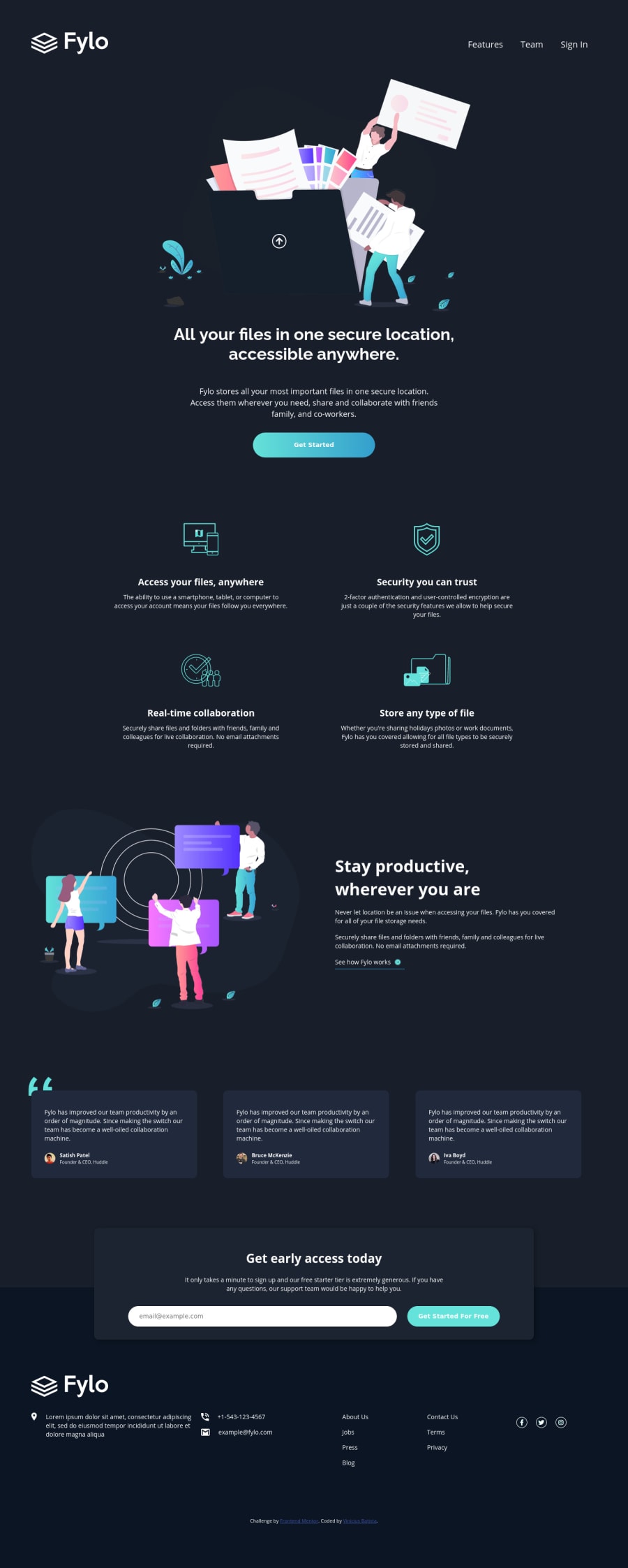
fylo-dark-theme-landing-page-master with HTML&CSS3
Design comparison
Community feedback
- @grace-snowPosted over 3 years ago
Hi
I recommend you fix the errors in your report. Look into flex-basis instead of width on flex children. Also look into column properties in css - your divs inside the footer are invalid HTML, but at the moment the list (contact-list > ul) has lost all semantics anyway so should not be a list. Semantically, the first two desktop columns should be in a list, the next two columns in a nav element (with list inside) and the social links in a third list.
Other issues I can spot...
- The logo is probably the most important piece of info on the page. So
logoas the alt text is no good. What is this site/product? That's what alt should communicate. - I can't work out why the button and input font-size is only 11px at the moment (too small). These elements don't inherit font family either, so you need to set that on them.
- With images, if only serving one, do not use the picture element. That is only for serving multiple different resolutions.
- you can only have one h1 per page
- alt descriptions need to be readable descriptions. hyphenated words like you have now cannot be read out, and the current descriptions don't actually describe the image. e.g.
profile-1instead of the person's name - Almost all the content in the footer needs to be wrapped in anchor tags
- If you do include another nav element in the footer as I suggested, give it an aria label of footer
- Try to make focus states more visible on these dark backgrounds. They are hard to see at the moment.
Overall, layout is pretty good on this and you've clearly done a lot of work. But the HTML semantics needs real attention to get right as it's the foundation for everything else.
Good luck
2@VbanetyPosted over 3 years ago@grace-snow Ok, I made too many mistake in this challenge and I forget to insert the background wave, I really appreciety your attention on my challenge, and again I'll try to give attention and read more about HTML semantic.
Thank a lot for all.
0 - The logo is probably the most important piece of info on the page. So
- @treboryxPosted over 3 years ago
Hi, there seems to be no wave in the background on the top of the page
1
Please log in to post a comment
Log in with GitHubJoin our Discord community
Join thousands of Frontend Mentor community members taking the challenges, sharing resources, helping each other, and chatting about all things front-end!
Join our Discord
